Hot week, not much time, and several days when not a thing was accomplished, and then I included a subject I could talk about forever. But guess what, the newsletter still made it kind of on time. Whatever`s in that midnight oil must be good.
This week has been too hot. I do not like the heat and nor does buster, so we sit either in the driveway out the front, or in the back garden on the grass. Both of these are borderline for receiving the internet signal and it has a habit of cutting out suddenly. I know this, all too well, yet I do not save as I go along. It is just something I never think of.
Anyway, enough waffling. You want to know what I have discovered, and plucked from my box of delights in order that you may contemplate or act upon it. So this week we start with a wartime contrivance, and the original picture of it on which the card was based. Then we move on to a spot of mechanised sewing, pursue the story of the Pentagon, marvel at a cinematic Carreras look-alike, salute an Uncle called Sam, and remember the great Peter Markham Scott and his Brooke Bond memorial.
So let me begin.....

W.D. & H.O. Wills [tobacco ; UK] "Military Motors" (October 1916) 22/50 - W675-121 : W62-87.b : W/80.B (RB.14/80.b)
Now if you look online you will read that today in 1914 saw the creation, or the formation of the Canadian Automobile Machine Gun Brigade No.1, the first fully mechanized unit in the British Army. And there is a picture in the archives of this very vehicle.
However I have not been able to find any proof that today was that actual day. I do know that the idea was formulated by a wealthy ex-miner, Raymond Brutinel, then living in Canada, to where he had emigrated about ten years before. There seems to be some confusion about whether he was still a serving officer, some say he was, but others say he was planning to rejoin which must mean he had left. Anyway somehow he had acquired a quantity of machine guns, and he was planning to send those to France, until the Canadian government heard about it and convinced him to allow them to use them instead as part of an experiment.
The idea was to build an armoured car with no roof, above which the machine guns would protrude and be always ready for action. These vehicles were designed by Mr. Brutinel, and constructed to his plans over the border in America. These were then readied to go to France with a new Canadian brigade. Now this is where the date seems to come in because "on the 9th of September, 1914" there is a list of all the assets as it were of the brigade. For this to be dated must mean that something happened on that date to make it necessary, but whether that was the founding, or the readiness for war, or maybe the embarkation, which does necessitate the need for a list of what is being sent out. Anyway at that time there were only two of these "batteries" but eventually there were eight.
Many believe this that was the first ever "tank regiment" - and that the Royal Tank Regiment, formed in 1916, used many of the ideas of our brigade, which in the same year became the 1st Canadian Motor Machine Gun Brigade, with Mr. Brutinel becoming the Commander of the entire Canadian Machine Gun Corps and rising to Brigadier General. Sadly he is not mentioned on our card.
And though John Player`s "Colonial & Indian Cap Badges" contains several cards of Canadian Regiments - numbers 8 to 13 - this badge is not amongst them.
This set appears in our original Wills reference booklet part III, (RB.14, issued in 1949) as
80. 50 MILITARY MOTORS. Fronts lithographed in colour; backs in grey with descriptive text. Home issues, 1916
A. With "Passed for Publication by the Press Bureau 21.9.16" in blue on fronts
B. Without the above.
This information is slightly shortened for our World Tobacco Issues Indexes, to :
MILITARY MOTORS. Sm. Nd. (50). Front (a) with (b) without "Passed for Publication by the Press Bureau 21-9-16".
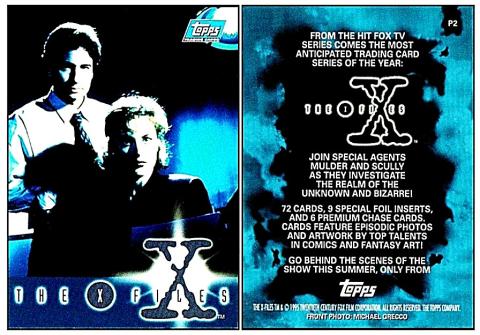
Topps [trade/commercial : USA] "X Files - first series - Promo Cards" (1995) P2/8 -
Today in 1993, thirty years ago, the first ever episode of "The X Files" was screened on American television. Very briefly, it tells the story of the quest to expose the fact that aliens have been visiting our planet for many years, but the truth has been covered up by the government. There is a lot more to it than that, and it is still well worth rewatching. Some of us do it every year on this date, starting, as it all began, with "The Pilot" - and probably will forever.
Before I go further, there is a reason why I am starting with this, promo card number two - and there is good reason, because "P1", though being the first of the promotional cards, was given away at conventions purely to advertise the comics based on the television series - which were also by Topps. In fact the image on that card was the same image as on the cover of their first ever X-Files comic, known as "Not to be Opened Until "X"-Mas", and published in a limited run in December 1994, with the general release coming after "X"-Mas, in January 1995.
It was not until our card was given away, at Wondercon 95, that it mentioned the series of cards, billed as "the most anticipated trading card series of the year". The back of the card also told of the make up of that first set - "72 cards, 9 special foil inserts, and 6 Premium chase cards ... by top talents in comic and fantasy art". However, this turned out to be incorrect, there were only ever six special etched foil cards, and only four of the premium cards, which were known as "Finest Chromium" cards. And we know that this card was issued in America not just because of the date - but because, when the European set arrived in 1996, we only got the base set, not the etched foil, and not the chromium cards either.
Anyway whilst I am here, the rest of the promos were as follows :
Promos P.3 and P.4 also advertised the cards, and they used the same wording as above.
P.3 is art drawn, by Thom Ang, and shows a figure climbing up a vertical tunnel and reaching out into a bathroom - it was based on the character Eugene Tooms, who appeared for the first time in episode three of the first series, and who could elongate his anatomy in order to squeeze through tiny spaces. There is also a variant of this card, inset into a 5-3/8" x 7-1/4" sheet; this was issued with the magazine "Wizard"
P.4 is art drawn, by Thom Ang, and shows a figure in a fetal position - that was based on the character of Colonel Robert Budahas, a former air force pilot. Strangely, he appears in episode two of the first series, before we meet Eugene Tooms.
P.5 returns to being an actual image of the two stars, and again it also appears on a Topps comic cover, this being number five, issued in May 1995. However this card was issued with "Wizard" magazine.
P.6 is also an actual image of the two stars, and that came from the cover of the very next edition of the Topps comic, number six, also known as "Firebird", and issued in June 1995. Yet again though, this was issued with another magazine, the Non-Sport Update.
However P5 and P6 have different wording, for they now read : "72 cards, 10 Super Premium Chase Cards, and much more". Perhaps "much more" referred to a parallel set, which was not mentioned on this card. It was the same as the base set, but with foil-stamped titles added to the front of the cards. The only problem was that you only got a single one of these cards if you bought a whole box, and only then in North America, for it was never extended to Europe.
And if you bought a case of boxes your extra incentive was an uncut sheet of the six etched foil cards.
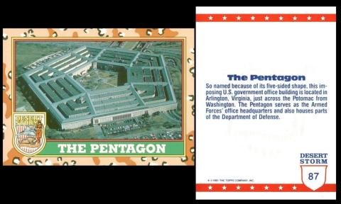
Topps [trade/commercial : O/S - USA] "Desert Storm"
Kind of a neat link from "The X-Files" to this building which began construction today, September 11th, 1941, on land which was actually seized from the Confederate General Robert E. Lee during the Civil War.
The new owners did nothing with it, until a Brigadier General remarked that if America did enter the Second World War they may need a new, more modern facility from which to operate, and also extra room to fit in new departments. The idea was considered, but it was only allowed on the grounds that after the war was over it would be repurposed for non military occupation.
The building used only about three hundred of the thousand acres that had been confiscated. And it took about a year and a half to build. The shape was dictated not by its resemblance to a shield, or that it would have a face to every direction to combat enemies coming from all sides, but simply by the fact that there were five roads around it and it seemed to work. However the construction was definitely odd, for it had four rows of concentric pentagons inside the outer casing with gaps in between, like a labyrinth.
During the Second World War more departments moved in, streamlining movements and messages and it was decided to keep that intact rather than giving the building up. That is why it is still a command center, in which purpose it is shown here.
That makes it odder that this seems to be the only card that shows it. Unless you know of another?
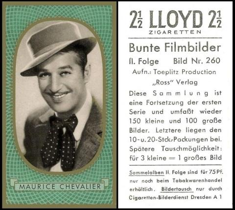
Martin Brinkmann A.g. [tobacco : O/S : Germany] “Bunte Filmbilder” (1936) card 260 – B693-100.2 : B110-3.2
Now is it only me or does this card look like the issue by Carreras, called "Film Favourites"? Even more curiously, did Carreras see this and like it and base that set upon it. For the Carreras version was issued in 1938...
The reason for this card is that today Maurice Chevalier was born in 1888. And that means that when he made "Gigi" he was actually seventy.
Before that he did many things. He started out as a talented acrobat, but was badly injured. He liked the theatrical life though, and so started singing, a task he could do whilst standing still or even sitting down. He also started making movies, the first being in 1908. However that came to an end for the First World War, in which he enlisted, and during which he was wounded, captured, and found himself a prisoner of war. In the camp were many English Tommies, from whom he learned English.
After the war he went back to films and used his new language to move into "talkies". He also moved to Hollywood, where he became much sought after for musicals.But yet again his career was interrupted by another World War, during which he was accused of entertaining the enemy, by singing at the prisoner of war camp at which he had been detained in the war before. However he managed to clear his name and once the war was over returned once more to films, during which he made some of his most popular, and lasting performances.
This card is from one of the many German film star sets that are so impressively designed with mock frames of burnished gold. The fault, however, is that sadly they have no biographical details about the star. This is because the cards were designed to be stuck in the lavish album which was produced for it, and in which the text was already printed.
Now “Lloyd Zigaretten” is actually a brand not a maker, and many thanks to the reader who pointed that out before I was even awake to look in the reference books. And you can see a larger card, of the first series, issued under the company name of Martin Brinkmann in our newsletter of 24 June 2023.
The anomaly seems to be that the first set actually says Brinkmann, but the second series only has the brand. This is clarified in our World Tobacco Issues Indexes – where the description reads :
BUNTE FILMBILDER (Coloured Film Stars). Sm. 60 x 33 (150) and Lg. 72 x 58 (100). See X24/2B.
1. First Series (250). With firm’s name
2. “II Folge”, Nd. 251/500 (250). “Lloyd Zigaretten” brand issue.
The X24/2B, which is part of the original handbook, that was at first issued as a separate volume to the World Tobacco Issues Index, and then combined as a double volume, opens up a huge network of other issuers of this set. The set is also described again, as :
X24/2 BUNTE FILMBILDER (Coloured Film Stars). Two numbered series, each small size 60 x 33 m/m (150 subjects) and large size 72 x 58 (100 subjects). Pictures in black and white, coloured framework, gold borders.
1. First Series. Numbered 1-250.
2. Inscribed “II Folge”. Numbered 251/500A. Austria G.m.b.H. of Munich, Germany (1) and (2)
B. Martin Brinkmann A.G. of Bremen, Germany. (1) with firm`s name (2) brand issue. Inscribed “Lloyd Zigaretten”
C. Zigarettenfabrik Greiling A.G. of Dresden, Germany. (1) and (2)
D. Jasmatzi Cigarettenfabrik G.b.m.H., of Dresden, Germany. (1) not studied (2) brand issue, inscribed “Unsere Marine”
E. Massary Cigarettenfabrik of Berlin, Germany. (1) and (2) Brand issues, inscribed “Caid”
F. Orienta Cigarettenfabrik G.b.m.H., of Dresden, Germany (2) only known
G. “Polo” Brand issue, maker unknown, but they were based in Dresden, Germany (2) only known
H. G. Zuban A.G. of Munich, Germany. (1) and (2)
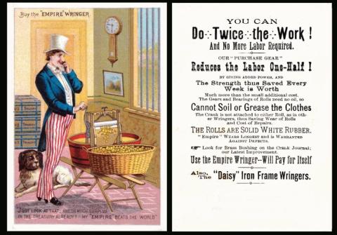
Today in 1913 it is recorded that the character of Uncle Sam was first used in advertising.
And as for the most famous of all - well that was the 1917 recruiting poster for the U.S. Army, where he was drawn by James Montgomery Flagg.
Now the whole idea of an Uncle Sam seems to have come from a Sam Wilson, who was a New York meat trader. There are several versions, but most seem to tie it down to some time during the war of 1812, which was against Great Britain. Anyway Sam Wilson was involved with shipping beef to the U.S. Army, and somehow the U.S. which was stamped on the barrels was connected to the producer Uncle Sam Wilson. This seems rather thin a connection to me.
However we do know that before this date there had not been any mention of an Uncle Sam.
The first ever human symbol was Columbia, who represented America since 1738, even before the America we know was born. However she was replaced in 1775 by a male emblem called Brother Jonathan. He was really the symbol of New England, but he is interesting because he looked remarkably like Uncle Sam, and even wore the same costume of striped trousers, plus a black coat that seems reluctant to button, and a stove-pipe hat. So this does lead us to the fact that many of the early advertising cards may not be Uncle Sam at all. However we do know that this probably is, because the Empire Wringer Company was based in Auburn, New York, incorporated in December 1876, and their trademark was registered on May 3rd, 1887. This card is quite unusual for it has not been overprinted with a trade name, usually you find this advert but with a local retailer below. This proves that the Empire Wringer Company supplied these cards to the retailer as a kind of business card as well as an advertisement and they presumably also arranged for them to be printed up whenever a new retailer decided to sell their wringers.
However, the company was not destined to last long, and in 1891, it merged with the Bailey Wringing Machine Co., the Metropolitan Mfg. Co., and F. F. Adams Co. to form the American Wringer Company. This new company seems to have used the same factories, because one was in Auburn, New York, but the individual names were no more.

Brooke Bond [trade : tea : UK] “Wildlife in Danger” (November 1963) /50 – BRO-380 : BRM-22.A : B.12
This is one of the many Brooke Bond Tea cards that was issued from the 1950s to the 1990s, but it is one of the few that was illustrated and described by Peter Scott, who was born today in 1909.
In fact his full name was Peter Markham Scott, and he was the son of the polar explorer Robert Falcon Scott. His father died whilst on an expedition some time in March 1912, and the bodies were not found for over six months. He did not follow in his father`s footsteps, though he did join the Navy, and was a very good sailor, in which capacity he won a bronze medal at the 1936 Summer Olympics. His great love was a different kind of exploring, of the natural world, and he soon became a keen ornithologist, observing and breeding birds at home. He also painted them, and after he left school this was his main means of support, exhibiting them at several galleries, and also writing and selling illustrated books.
The surplus funds bought land, and on that land, in 1946, he started the Wildfowl and Wetlands Trust in Slimbridge. This almost certainly led to his involvement in helping found the World Wildlife Fund, later renamed The World Wide Fund for Nature.
This was not the only set of cards he worked on, for in 1971 he was involved in a set for Shell Oil, called "The World Wildlife Collection" In total there were sixteen three-dimensional cards which flickered as they were tilted.
Two years later he was knighted.
He died in August 1989.
This set appears in our British Trade Index part II, (RB.27, issued in 1969), as :
WILDLIFE IN DANGER. Sm. Nd. (50)
A. Back in blue, London address. B.12
B. Back in magenta. Rhodesia. SR.5
In our follow up, British Trade Index part III, (RB.31, published in 1986) notice is given that this set was one of the ones that were reprinted with black backs to sell to collectors in the mid 1970s. That gave us a new line to insert below the above, of BRM-22.C
However by the time of our updated single volume British Trade Index (RB.125, published in 2006) the text had changed. It now reads : "WILDLIFE IN DANGER. 1963. Nd. (50). Also issued in Rhodesia (magenta back)." There is no word of this printing having the blue back, nor that the black back was issued later as a reprint.
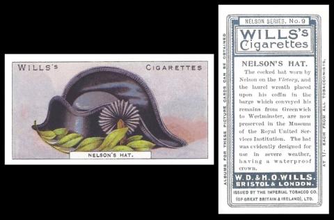
W.D. & H.O. Wills [tobacco ; UK] "Nelson Series" (September 1905) 9/50 - W675-125 : W62-92 : W/85 (RB.14/85)
Today is curiously known as "felt hat day". Now as few people wear such things any more I will explain that on this day, every year, you put away your felt hat and started to use a heavier, winter one. However since few people do that these days, the day has been retained and it is now used as a day to find out about the story of hats and hat making.
Now we went for this card entirely because it was a hat, and it was issued in September, and I will now be able to add it to our gallery of monthly issues. However it turns out that this hat, made by Lock & Co, is not only the one he wears on the column in Trafalgar Square, but they also made his eye patch, which, rather fittingly, was made of felt.
This set appears in our original Wills reference booklet part III (RB.14, issued in 1949) as
85. 50 NELSON SERIES. Fronts lithographed in colour; backs in grey with descriptive text. Two grades of board (a) white smooth (b) off white rough. Home issue 1905. There were two printings of Card No.5 :- (a) "Mainmast of the Victory" ; (b) "Fragment from Mainmast of the Victory" - the additional words being superimposed on the metal collar at the base of the mainmast.
This is way shortened by our World Tobacco Issues Index, to : "NELSON SERIES. Sm. Nd. (50). See W/85"
This week's Cards of the Day...
for some reason celebrated the opening of the New York Post Office, or rather the one by Mead McKim and White that was opened in September. And it was one of those weeks when I failed to look and see how many cards it was actually on before selecting it so it was kind of hit and miss - but not quite as bad as "Christmas Jumper Week", which will haunt me until the end of days. Once you have had a week like that anything is possible!
Now there seems to be some confusion over the actual date of that opening, and various sites have it as either the 5th, 6th, or 7th of September 1914. Some of this can be explained by the fact that the contents of the old Post Office building had to be removed into the new one, which could not have been a one day job, but as far as we can prove the official opening date was the 5th.
Now whilst there is no official motto for the Post Office, in America, or oddly in Great Britain, there is a saying which is connected with the American service, and that is chiselled over the entrance to the building. It reads : "Neither snow nor rain nor heat nor gloom of night stays these couriers from the swift completion of their appointed rounds.". The legend that the building had to be demolished and enlarged so that all that would fit above the doorway is almost certainly untrue - but amusing. We must also say that the Post Office did not write it, nor employ anyone to, for it dates back to Herodotus, the Greek historian and author, and he wrote it in a book called "The Persian Wars", paying tribute to the postal couriers who rode their horses so fearlessly to deliver messages to and from the front line.
In fact the idea of the Pony Express was also based on the same story.
Saturday, 2nd September 2023
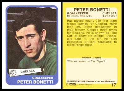
Now for our first clue of this week we had this card, which showed Peter Philip Bonetti, the famous goalkeeper, who played more than seven hundred matches for Chelsea alone, but also took part in the World Cup in 1970, as a last minute substitution for Gordon Banks.
The American connection was because in 1975 he left our shores and joined the St. Louis Stars. And the post office connection was because after he retired from football he moved to the Isle of Mull, and became a postman.
Our original British Trade Index part II tells us that this set is from the "Footballers Grouping" which appears in full with the Card of the Day for October 19 2024, simply because that was the first football set ever to be issued by A & B.C. Gum, in 1958-1959. All the other sets are tackled like today`s, in as much as they simply repeat their section of the listing, and not how it interacts with the other sets.
So today`s card is listed as :
FOOTBALLERS GROUPING (A). Md. or Lg. 8 backs illustrated at Fig. ABF-10. Nd. ... ABF-10
9. Portrait in rectangle with rounded corners, white border team name in pennant at base. Back in yellow. 81 x 55. (101)
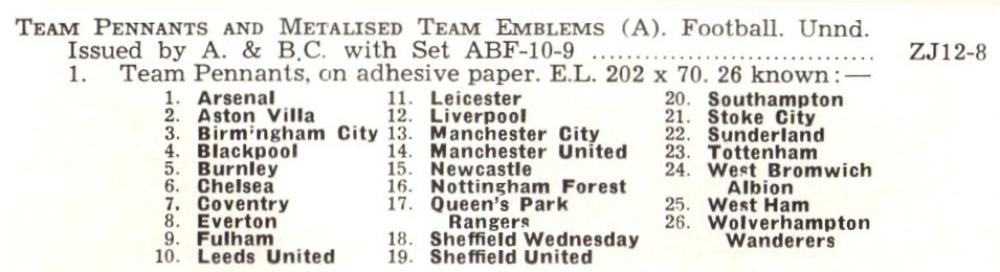
1. Nos. 1/54. No. 1 is unnumbered team picture of West Bromwich Albion, back "Football Check List". Anonymous team pennants, see set ZJ12-8.1, were issued with this section.
2. Nos.55/101. No. 55 is unnumbered team picture of Manchester City, back "Football Check List". Anonymous Metalised Team Emblems, see Set ZJ12-8.2 were issued with this section
However, though this set is listed at the end of this grouping, it does not appear in the picture. I speculated that this was because the picture, of the first eight sets, was extracted from a magazine which was printed before our set for today was issued. And when it came time to make a British Trade Index, they simply used it, rather than make a new block, and tacked set nine on the end as a listing without a picture.
Before we race ahead, there is a curious anomaly with this set, and that is that you can find the cards with or without a football logo in the banner which holds the player`s name, and in just one instance, shown at the Trading Card Database/Joe Baker, you can find that one card with and without the logo. Unless anyone out there knows of another card which has both? You can also find a checklist of the set at the Trading Card Database/1968 - as well as a really curious item, the original negatives.
Now as far as the second part of this set, numbered 55/101, that appears as our Card of the Day for the 17th of August, 2022 - however, as the anonymous extras are specific to one part of the set only they are tackled in detail on each page, so here we only have the team pennants, the listing of which which reads :
We know that the packets for this set cost 3d. and the pennants are advertised on the front thereof. However it does not say how many cards you got. It also looks like the pennants were treated in the same way as the Civil War banknotes, and folded in half, or sometimes even thirds, to fit the packet.
Now when we get to the updated British Trade Index there has been some changes, most notably the total of cards given for the set. This reads :
FOOTBALLERS (A) 1968/69. 81 x 56. Nd. (146). H & S portraits in rectangle with rounded corners. Yellow back borders. English issue in two batches, Nos. 1/45 listed at HA-14 to distinguish from Scottish issue, [also] numbered 1/45
1. Nos. 1/54. No. 1 is unnumbered team picture of West Bromwich Albion, back "Football Check List".
Now this does not mention the Anonymous team pennants, because they have been moved out of the Z section and inserted a bit higher up on the A. & B.C. listing.
Sunday, 3rd September 2023
So here is clue number two to this week`s theme.
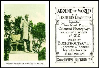
Our second clue was the subject of this statue, Abraham Lincoln, the sixteenth President of the United States, who was born in Kentucky on February 12th, 1809.
That deals with the American connection.
And as for the postal one, well, he was appointed postmaster of New Salem, Illinois on May the 7th, 1833 and served for a period of three years. He would have served for longer, but in 1836 he was elected to the Illinois House of Representatives, and so started his political career.
He enjoyed the job, and he found the magic in it, for it allowed him to chat with local people, and he soon worked out that he was much more likely to see some people, in person, along his route than others, so he would carry those in his hat, and be able to give them over in person, by removing his hat with an exaggerated motion.
He was paid for the job, almost $56 dollars a year in 1835, and he also had perks. He could send mail free, and he was awarded free delivery of one newspaper of his choice. Sadly I have not been able to find out which paper he chose.
Now you may read that President Truman was also a postmaster, and he was, but pretty much in name only, for as soon as he was appointed he gave over both the position and the salary to an assistant.
Now as this card comes from a larger group, and to save repetition, we will direct you to the entry for the second set, which is the first that we have so far. That was the Card of the Day for the 7th of January 2024.
Monday, 4th September 2023
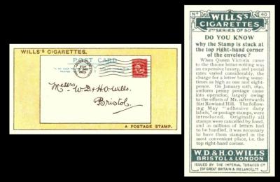
Our third clue showed a letter, and I hope you noted the not-so-subliminal advertising with the address that was shown thereupon?
Now this clue brought you the post and the post office for sure. But the American connection is a bit harder to come upon. However it was that W D & H O Wills, along with John Player, and several smaller companies joined forces to form The Imperial Tobacco Company in order to stand against the ever growing might of the American Tobacco Company founded in 1890 by J. B. Duke - who provided two of our cards this week
This set appears in our original Wills reference booklet part IV (RB.16, issued in 1950) as part of the combined listing to all sets. However each of those sets was granted a separate ordinal number, ours being :
189. 50 "2nd Series of 50" Issued 1924.
A. Home issue. Wills` name and I.T.C. Clause at base of back
B. General Overseas issue. Anonymous backs.
Similar series issued by Melachrino, Hamburg. See RB.21/200/188.S
Now this Melachrino reference is intriguing because RB.21 was printed in 1952, and inside of there it states that "...two cards seen in this printing are numbered 24 and 27 and are the same subjects as Wills` 2nd, Nos. 47 and 11." However under X.21/200-188 in the Handbook to the World Tobacco Issues Index, issued four years after, it says that only one card has been seen by Melachrino, and this was card 34, which was as Wills 2nd, No.50. Surely that makes three cards?
Also in that section it tells us that British American Tobacco issued it as well, through their Gold Dollar brand, but only two cards had been seen, one being a Wills 1st series, namely No.35 (but used by Gold Dollar as card No.1) and the other being Wills 2nd series No.21 (but used as card No.28). That led to the belief that these sets, both German language by the way, were probably of 50 cards, but comprised cards selected randomly from Wills 1st and 2nd series, and maybe the later ones.
If we look at the World Tobacco Issues Index, this arrangement has ceased, and all are together under W62-127, with just a number to denote each series. Ours is 2. "2nd Series of 50", though the main header for the set does still give the RB.21 reference.
Tuesday, 5th September 2023
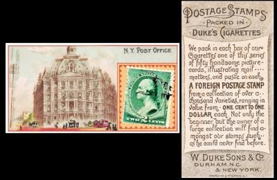
Now here we have the New York Post Office, or not, because this card was issued in 1889. The truth is that they did not get the date wrong, for this is the first New York Post Office, known as City Hall Post Office and Courthouse, and located along Broadway in Lower Manhattan. That started to be built in 1869 but was not finished until 1880. It was never popular, though it stayed in place long after our building had superseded it, and was only demolished in 1939.
This set is listed in our World Tobacco Indexes, under Duke section 1, covering "regular coloured issues in U.S.A." as :
POSTAGE STAMPS. Sm. Real postage stamps affixed to series of cards "illustrating mail matters..." Unnd. (50). See ABC/85. Ref.USA/85
A. Centre wording on back "A Foreign Postage Stamp", (a) with (b) without printers` credit at base.
B. Centre wording on back "A Genuine Foreign Postage Stamp"
The only difference between the vintage and modern editions is that the text to A. now reads : "A. Centre wording on back "A Foreign Postage Stamp" (a) with printer`s credit (50) (b) without printer`s credit (only 25 subjects believed issued).
Wednesday, 6th September 2023
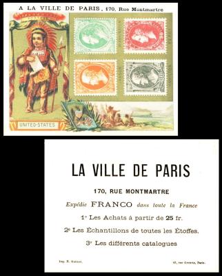
So I have found a bit more out about this card since its original insertion. La Ville de Paris may indeed translate as the town of Paris, but it was some kind of department store, with two addresses, either 170 or 174 Rue Montmartre, but the latter says that was the former Hotel des Messageries Francaises, which is a kind of link to our theme as a Messagerie is either a courier or shipping service.
The text on our card offers 1. storage of your shopping, 2. fabric samples, 3. different catalogues. The idea of catalogues have now been superseded by the internet, which I do not find so interesting, for you cannot look at leisure, and no longer can the joys of thumbing through a seed catalogue and makng notes on every page occupy an entire winter.
On another card of theirs, there is a list of their wares, namely "Modes et Coiffures, Rubans, Articles de Paris, Fleurs et Plumes, Mercerie, Passementerie, Ganterie. Corsets, Parfumerie". Now as this translates to Fashion and Hairstylings, Ribbons, Parisian Goods, Flowers and Feathers, Haberdashery, Trimmings, Gloves. Corsets, Perfumery, its pretty obvious that it was a department store more for ladies than for men.
By the way, the card was printed by Hutinet.
This set seems to be world stamps, as there are reproductions of several postage stamps on each, and in the larger box a child dressed in the costume of the country which issued those stamps. In addition the top cartouche, above the child, contains the word, in that country, for postage. So this one we show today is the United States, but we know of the following, and maybe you can add even more....
- Correos - Espana
- HOYTOBR - Mapka (Russia)
- KK Poste - Tempel ? (the stamps are in Kreuzer, so possibly Austro-Hungary?)
- Postage - England
- Poste - Francaise
- Poste - Italiane
- United States
Thursday, 7th September 2023

This card is a rather tenuous link to "Mail", but it is a great card. This shows Jonas Mills Bundy, the editor of the New York Express and Mail, and he died in September 1891, aged just fifty-six
The newspaper was the result of a merger, in 1881, between the New York Weekly Mail, that had started in 1873, and the New York Weekly Express, which started in the 1840s and was an enormously busy enterprise which maybe just ran out of steam or money, for it began as a daily paper with a Saturday special, moving to weekly on Fridays in 1843, but also issuing a weekly express on Wednesdays. Sadly, the combined "Weekly Mail and Express" was rather short lived, or perhaps the title was simply altered to just "The Mail and Express" once everyone realised it was weekly.
The last edition was in 1904.
This small sized set has the honour of being catalogued by Jefferson Burdick as USA/1, albeit purely through alphabetical order for USA/2 is "American Indian Chiefs". The listing there reads :
- 1 - American Editors (50). 1st series, numbered. A 2nd series was not issued.
If you look at the reverse of the card you will immediately see he is right, the cards all say "First Series", but there never was a Second Series, and yet one must have been planned, in order to have taken the time and effort to add that to the first fifty cards. He also rates them quite highly, valuing them at 50 cents a card, for out of the thirty four Allen and Ginter sets he lists none are more expensive than ours, and only "Fruits", "Great Generals", and "World`s Sovereigns" equal. And of the large cards, this is the only set of the entire ten which is valued at 50 cents.
And you can see a card from that larger version as our Card of the Day for the 7th of October, 2025
His listing was used for our World Tobacco Issues Indexes, where it appears under Allen & Ginter`s Section 1, for "Issues in U.S.A.. Series issued before 1890.", which is when they founded the American Tobacco Company - and sub section 1.A. "Coloured Issues. Small size approximately 70 x 38, large 83 x 72 m/m. The large size shows the corresponding small card design with other matter added".
Our set is again first up, and described as
- AMERICAN EDITORS. Nd. (50) ... A36-1
A. Small. Ref. USA/1
B. Large. Ref USA/35
And this text also appears in our updated version of the World Tobacco Issues Index, just with a new card code, of A400-010.
Now before I race on do note that this set was also produced as a printed album, the earliest such album to be produced, in 1887, the same year as the cards were issued. This initially led me to wonder if these cards were issued first of all the Allen & Ginter issues, but they were not; that honour goes to the 1885 "Photographic Cards", of which there are hundreds, covering all subjects, and including a sub set of sixty-six "Girl Cyclists".
These printed albums were exchanged for coupons, and the one which is based on our set is catalogued as being 231 x 153 m/m and ten pages plus covers. And curiously, it also says "First Series", yet had no second.
Now we also have a list of the editors, which you may think ought to be here, but it is actually housed with the large sized cards, as our Card of the Day for the 7th of October 2025. As to why, well this is because it also includes the name of the subject used for the additional scene - which only appears on those larger cards, and does not feature on these small sized versions
Friday, 8th September 2023
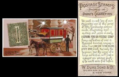
Now if you did not notice, this is a different reverse to the card we had earlier in the week. This one is the "B" version where the word "Genuine" is added to the description on the reverse.
Now we do not know why this was added, or whether it was removed. It seems more likely that it was added though, and perhaps to combat other sets of cards which were being issued by different manufacturers with stamps on them.
This set is listed in our World Tobacco Indexes, under Duke section 1, covering "regular coloured issues in U.S.A." as :
POSTAGE STAMPS. Sm. Real postage stamps affixed to series of cards "illustrating mail matters..." Unnd. (50). See ABC/85. Ref.USA/85
A. Centre wording on back "A Foreign Postage Stamp", (a) with (b) without printers` credit at base.
B. Centre wording on back "A Genuine Foreign Postage Stamp"
The only difference between the vintage and modern editions is that the text to A. now reads : "A. Centre wording on back "A Foreign Postage Stamp" (a) with printer`s credit (50) (b) without printer`s credit (only 25 subjects believed issued).
And there I must close. Not too bad tonight, and for once it will appear more or less completely finished at the stroke of midnight. Though there are a couple of card codes yet to add, those being cards that I had to change my mind about nearer the end of the week, the Lloyd of Maurice Chevalier, which was another card that I failed to get to scan too many times, it was lightly printed and when I tried to make it darker it just went blurry, and I knew this Tuesday but would not give up. The other is the Brooke Bond of Sir Peter Scott, I had the card but kept forgetting to look at the trade index because the other trade cards were not in there, the Topps being too late and American and the Empire Wringer being American too.
Just as I began, I end with a ramble.
Thanks for tuning in, and I hope you are rewarded. Come back next week too. And remember if you enjoy our newsletters tell your collecting pals to come along and read them too.....