Saturday, again, already. Where does time go? Ah, you see, but I have wasted it with little to show for it, when I ought to have done so much....
I have to say these light nights are to my liking in many ways, it has been almost a quarter to eight and I have still not drawn the curtains. Mind you I cannot see the keyboard, and there are frequent mis-strikes, which cause me to retrace my steps, and start again.
I am looking forward to the summer in many ways, but not in others, for it will be hard to have all that time in the garden, but alone, with no little four legged fur legged chap to have to watch over at all times, to frequently have to stop my work in order to stop them chasing rats, or digging, or barking, or to remove a thousand burrs and forget me not flowers from all over their face.
To stay alone, in the peace and quiet, or not.... that really is the question, right now.
But time to chat about cards. And lets start with :
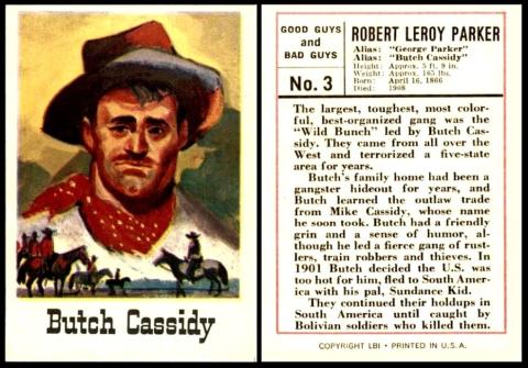
Leaf [trade : bubble gum ; O/S : USA - Chicago] “Good Guys and Bad Guys” (1966) 3/72
Today in 1866 Robert Leroy Parker, also known as “George” Parker, and as “Butch” Cassidy, was born. And I have to say I always imagined him tall, rugged, and handsome, like Paul Newman, but seeing this card he looks more like Joey, from “Friends”...
Anyway the card suggests that he was born into lawlessness, that his “family home had been a gangster hideout for years”. This is not actually true, for his parents were English, and had converted to become Mormons even before they sailed to America.
In fact our man rebelled at the strict family ways, and ran away whilst he was still in his teens, his first brush with the law coming at the age of just fourteen. He found work on ranches as he travelled, and it was at one of those that he met the cattle thief Mike Cassidy, from whom he took the new surname. There are rumours that this was done to prevent his parents finding him and dragging him home, but he did not change his name until he was far gone from there, adding the “Butch” in memory of the time he did do proper work, albeit briefly, as a butcher.
He was twenty three when he robbed his first bank, and he used some of the money to buy a ranch in Wyoming. This was very close to an isolated area of the country which was a known hideout for men on the run, and it seems very likely that our man would have been willing to furnish them with help. In fact this is almost certain to be the home which fits the bill of “gangster hideout” as mentioned on the card.
Eventually our man was leader of a gang that were into stealing livestock and personal property, and robbing trains. When he was twenty-seven he was caught, for stealing horses, though there were rumours that he was also running a protection racket in the area and stealing from the same people at the same time. He served two years in jail for that.
He never did mend his ways. Lawmen chased him and his gang relentlessly, especially after they killed a sheriff during a train robbery in June 1899, and then more lawmen in subsequent events.
In 1901 he upped and left the gang and travelled to New York, with his friend, Harry Alonzo Longabaugh, also known as (The) Sundance Kid, who had also brought along his girlfriend. They then sailed down to Buenos Aires and bought some land in Patagonia, intending to become farmers, but instead were soon up to their former activity, robbing banks.
Then in 1908 they were caught in Bolivia. Some say they died in the escape – others truly believe they got away, laid low, and maybe gave up the robberies, or kept them small enough for anyone not to notice. There are lots of stories, if you hunt them out, that tell a very plausible tale of the fact that our man did return to America, and only died in the late 1930s.
These cards were issued in wax wrappers, and billed as “Good Guys and Bad Guys - Authentic Portraits and True Life Biographies”. Each packet cost five cents. The front of the wrapper shows three cards, so I am presuming that was the contents. And at this time you also got gum, which makes this set a proper trade set.
Now this appears to be his rookie card, but I think there must be earlier. Almost forty cards are listed at the Trading Card Database/BC, but most were issued quite recently, and several of them use the same photograph of him, in a bowler hat. Now that picture is actually just a small part of a studio portrait of him and his "Wild Bunch" which was taken by John Schwartz in 1900/1901.
The other portrait which is used on the more modern cards appears to be from a "Wanted" poster, but colourised for the card, as the original would have been black and white.
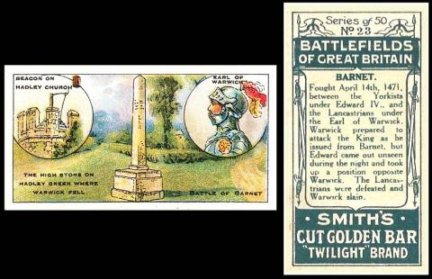
F. & J. Smith [tobacco : UK] “Battlefields of Great Britain” (December 1913) 23/50 – S548-050.C : S84-2.C
If you were in the leafy suburb of Barnet, today, in 1471, you would have probably found yourself press ganged into war, and taking part in this battle.
The card tells us that this was fought between the Yorkists under Edward VI and the Lancastrians under the Earl of Warwick, who is shown, be-plumed, on the front of the card, and yet he was the loser, killed on the battlefield where the monument was built. Or maybe they are celebrating him because of the fact that Edward VI pulled a swifty and though “Warwick prepared to attack the King as he issued from Barnet, Edward came out unseen during the night and took up a position opposite Warwick.”
The mention of the Yorkists and Lancastrians should send you back to school and retrieve, rightly, the fact that this was during the Wars of the Roses. In fact this was a crucial battle in those wars, and after it Edward VI claimed the throne of England, and remained there for fourteen years.
In fact the Earl of Warwick was once a Yorkist too, but defected, feeling aggrieved at many things. It turned out at first that he was probably a man that would have been better to appease, for his Lancastrian army started strong and he beat Edward so soundly that he was forced to run away, all the way to France.
Perhaps that is the true reason why Edward caught him on the hop.
This is another of the multi-backs and it is quite an unusual one, for Cut Golden Bar, in the “Twilight” brand. This was tobacco, and curiously it was also a name used by W.D. and H.O. Wills, who described their “Cut Golden Bar” as medium strength, straight, or unblended, Virginia tobacco.
One curious thing is that in the updated World Tobacco Index this brand is just “Cut Golden Bar”, not Twilight Brand. The rest of the entry is the same though.
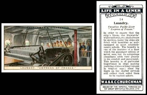
W.A. & A.C. Churchman [tobacco – UK] “Life in a Liner” – small (February 1930) card 14/25 – C504-580.A : C82-65.A : C/93 [RB.10/93]
Now today is National Laundry Day. No, I didn’t know there was such a thing either, but there is, and it’s today.
We originally intended to go the soap and suds route with a trade card, but then we were shown this cigarette card of a actual laundry, on board the Canadian Pacific Liner “Empress of France”. Of course we just discovered that we have used this set before, but we can sort that out!
The text tells us that this was primarily to clean the linen for the dining rooms and bedrooms, and the white uniforms of the staff. However it says that “many big ships are fitted with laundries as well equipped as most establishments ashore”. In fact the card is rather scathing of the fact that “some big liners on the shorter services still collect their soiled linen to be washed ashore”.
There are three ships called Empress of France, but ours must be the one built in 1920 in Scotland. She had quite a varied career, serving as a command post during the Tokyo earthquake of 1923, running aground in British Columbia in 1929, and becoming a troopship in 1939. She was finally torpedoed in 1943, by an Italian submarine. There were 392 fatalities, of whom most were Italian Prisoners of War.
You can see her from the outside on W.D. & H.O. Wills` "Merchant Ships of the World" (1924) 6/50, and on card 7 of the same set, but the version issued in South Africa by The United Tobacco Co`s (South) Ltd. Or alternatively she is on Teofani`s "Ships and their Flags" (1925) card 34/50
Of the others, one was built in 1912 for the Allan Line. On her launch she was called the SS Alsatian. She served in the First World War an armed merchant cruiser, and after the armistice she changed her name to The Empress of France. She was last used in 1931. The other one, also operated by the Canadian Pacific Steamship Company, because she was launched in 1928 as SS Duchess of Bedford, became a troop ship during the Second World War, but was not renamed Empress of France until 1947.
This set first appears in our original Churchman reference book, RB.10, published in 1948, as :
93. FEB. 1930. 25. LIFE IN A LINER (titled series). Size 2 11/16” x 1 7/16” or 67 x 36 m/m. Numbered 1-25. Fronts printed by letterpress. 4-colour half-tone process. Backs in dark green, with descriptions. Printed by Mardon, Son & Hall.
94. APRIL. 1930. 12. LIFE IN A LINER Similar format to (93), but size 3 5/16” x 2 9/20” or 80 x 62 m/m.
However in our original World Tobacco Issues Index the entry reads
LIFE IN A LINER. Nd.
A. Small. (50)
B. Large. (12)
This is wrong, for there are definitely only twenty five cards in the small sized set, as stated in the original Churchman reference book. It is corrected in the updated version of the World Tobacco Issues Index though, and that reads :
LIFE IN A LINER. Nd. A. Sm. (25) B. Lg. (12)
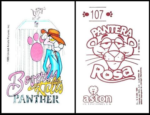
Aston Ediciones [trade : Spain] “Pantera Rosa” – “The Pink Panther” (1989) 107/
Centenaries, at least kind, gentle ones, are not so plentiful this week, but we have one today, marking the birth of Enrico Nicola Mancini, in Little Italy, Ohio, USA.
You would know him better as the composer Henry Mancini, who wrote, amongst many other things, the theme tune for the Pink Panther, and "Moon River" from "Breakfast at Tiffanys". He was also a musician, playing the piano and the flute. He was nominated for eighteen Academy Awards, winning four - two of them in 1961, for "Moon River". Then there was a Golden Globe in 1971 for "Darling Lili", and twenty-one Grammy Awards, the last one posthumously in 1995.
I do not know much about this item, and I even forgot to ask if it was a sticker or a card. Anyway it features the cartoon version of the Pink Panther in a variety of situations, here he appears to be a movie director, hence the mascot on top of the radiator being a panther with the megaphone. Note too that this is a skit on the RR of Rolls Royce, instead being PP for Pink Panther.
One clue is that the card does credit United Artists, 1989. That means it is not related to the original "Pink Panther Show", a cartoon animation which aired between 1969 and 1978. We do know that the original Pink Panther film of 1963, starring David Niven, was by United Artists. However, though there was more than one film, none fit the 1989 date, and it falls between the "Curse of the Pink Panther", released in 1983, and the "Son of the Pink Panther", released in 1993.
And maybe you can tell us a bit more?
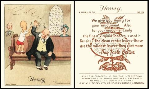
J. Wix & Sons [tobacco : UK – London] “Henry” - series 1 (1935) 49/50 – W805-060.1.A : W72-3.1.A : Ha.625
Another centenary, the birth of someone I had never heard of before, Stephen Taber III. He was a bee researcher, working on genetics, and especially trying to manufacture both a disease resistant bee, and a gentle one. This sounds an odd phrase, a gentle bee, but it does not only mean one less likely to sting you, it also affects their honey making, for the calmer you can make the bee, the less likely they are to swarm away, or at the beekeeper, and the better they are at carrying out the work the queen demands, like nest building, and looking after the eggs.
His work was highly regarded, and he wrote several books. And his interest began as quite a small child so this humorous study by Carl Anderson is very apt. It shows Henry watching the flight of a bee, and also attempting to advise a fellow churchgoer that a bee is about to land on their head.
Oh the stories that could be woven of this simple start; the chaos that will almost certainly ensue.
The set is huge, five sets in all, but the first two were available in two sizes, billed as large and extra large. The description from our original World Tobacco Issues Index is :
HENRY. Lg. 77 x 64 and Extra-Lg. 144 x 99. See Ha.625. Special albums issued.
1. “A Series of….” Numbered.
A. Large. Back “A Series of 50”, adhesive.
B. Extra-large. Back “A Series of 25”.
2. “2nd Series of ….” Numbered.
A. Large. Back “2nd Series of 50”. Adhesive, inscribed at base (a) “Ask for the …” (b) “Ask your tobacconist…”
B. Extra-large. Back “A 2nd Series of 25”.
3. 3rd 50 subjects. Large. Unnd. No full stop after “Copyright Reserved”
4. 4th 50 subjects. Large. Unnd. With full stop after “Copyright Reserved”
5. 5th 50 subjects. Large. Unnd. With dash after “Copyright Reserved”
In our updated version there is a slight change to the heading, because the special albums were only for the large size cards, not the extra large ones. Therefore that reads :
HENRY. Lg. 77 x 64 (special albums issued) and Ex-Lg. 144 x 99. See Ha.625.
There is also a slight change to set 3, changing “No full stop after …” to “Nothing after … ” – and to set 4, where it adds on “(except 1 card)”, without telling of the number that does not have the full stop after “Copyright Reserved”. The handbook tells us it is number 32 though.
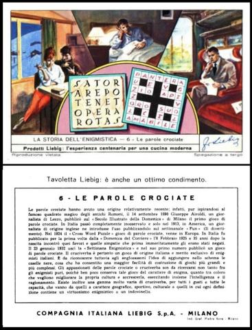
Liebig [trade : meat extract : O/S : Italy – Milan] “La Storia dell`enigmistica” – “The story of puzzles” (1963) 6/6 – S.1793
And the third Centenary in a row marks the publication of the first ever book of crossword puzzles, today in 1924, in New York, by Simon and Schuster.
However, as you can see from this card, the crossword began long before that, with puzzles carved in stone, like the one featured on the left hand side of the front, a Roman example, known as The Magic Square, where the letters fit in to make five perfect words both across and down. On the right of the card we have the modern equivalent, much easier, with black squares infilled to separate the words apart.
The text tells us that the first ever crossword was published on September 14th 1890, in Milan, (where this card was issued) and that it was in Italian. And that the first crossword in English in 1913. This, oddly was compiled by a Liverpool journalist, Arthur Wynne, but it was called a “word cross” and it was published in a New York newspaper.
We do know that the first use of the phrase “a cross word puzzle” was way earlier than both these events, that was in an American periodical dating to 1862.
By the way the title of this card is Le Parole (Italian for words) Crociate (Italian for cross–shaped). And the "cross" actually refers not to the shape of the grid, or the patterns inside of it, simply that some of the letters in one word interlock with the other.
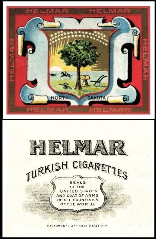
American Tobacco [tobacco : O/S : USA] “Seals of the United States and Coat of Arms of all Countries of the World” – Helmar brand (1909) Un/50 – A565-138.A : A54-68 : ABC/T.107 : USA/T.107
Lastly, a celebration of a place about which I know little, for today is National North Dakota Day. And I must ask if we have any members who are reading this from there? If so do say hi.
The state of Dakota was once Native American land, and it is called after the Dakota Sioux tribe. It is close to Canada, and part of the Great Plains, so would have furnished them with good hunting country. It was found quite early on by Europeans hunting the sort of animals which provided them with furs and skins to sell.
However it was never very popular with settlers, and still has the fourth lowest population of all the states - the lowest not being, as you may think, Alaska, but Wyoming. And actually less people live in Vermont than in Alaska. Alaska is third lowest.
In case you are wondering, Dakota remained the name of the state right until November the 2nd, 1889. On that date, in accordance with a bill signed by President Cleveland on February 22 of that year, it was split in half to become North Dakota and South Dakota.
Interestingly, according to the Trading Card Database/ND it was in that same year that the state was first featured on a card. This was issued by Arbuckle`s Coffee, as part of the "Illustrated Atlas of the U.S." On the front of the card there is a map, and it does seem at a close look that the word "DAKOTA" is much more visible, as if it were adapted from an old map, and they have simply added "NORTH" above it in a similar but slightly smaller text. As for South Dakota, that is in a totally different typeface, not even slightly slanted.
“Helmar” were Turkish cigarettes but it was a brand, so this set appears in our original World Tobacco Issues Index under American Tobacco Co Group Issues, where it is catalogued as :
SEALS OF THE UNITED STATES AND COATS OF ARMS OF ALL COUNTRIES OF THE WORLD. Md. 68 x 52. Unnd. (150) “Helmar” brand issue. See ABC/T.107. Ref USA/T.107
1. First fifty subjects (no special inscription)
2. Inscribed “2nd Edition – 1 to 50”
3. Inscribed “3rd Edition – 51 to 100”
However the back of our card definitely says “Coat” of Arms, in the singular. This is not picked up in our updated World Tobacco Issues Index either, which we add because it is slightly different
SEALS OF THE UNITED STATES AND COATS OF ARMS OF ALL COUNTRIES OF THE WORLD. Md. 68 x 52. Unnd. (150) “Helmar” brand issue, F7 and 30. Ref USA/T.107
A. Space below series title with Factory number only. All 150 subjects.
B. Inscribed “2nd Edition – 1 to 50”. 48 subjects known.
C. Inscribed “3rd Edition – 51 to 100”. 48 subjects known.
Jefferson Burdick calls the set simply "State Seals and Nat. Coats of Arms (150) Helmar" He values them at five cents each.
This week's Cards of the Day...
... celebrated the birth of Scrabble, the ever popular word game. It is the second most popular board game in the world, with an estimated total sale of a hundred and fifty million sets sold - only beaten by Monopoly with two hundred and seventy million.
It is a very simple game, and can be played at any age, growing in complexity with the vocabulary of the player. It is entirely possible to play a basic short game with words of three letters - or to combine shorter words and eventually make a fifteen letter one. The longest and most valuable word is Oxyphenbutazone, an anti-inflammatory drug, of fifteen letters, and that would score you, in the right place, 1,751 points. However it has not yet been used in any game that is known of.
Saturday, 6th April 2024
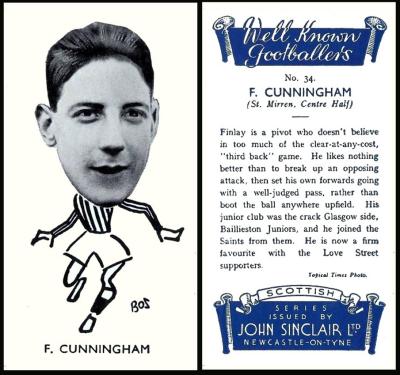
The reason for this card was the year of issue, because the game was invented in 1938, the same year. Its inventor was an unemployed architect, Alfred Mosher Butts, who had lost his job in 1931, just one of the many who did so during the Great Depression. He found it passed the time reasonably well to play games, do crosswords, and he suddenly had the idea to combine the two.
His initial idea did not change that much. This was a game involving each player selecting nine letter tiles, and seeing who could make the longest word. He instantly knew he was on to something good, a game which was simple to play, raised the vocabulary of every player, and did not have complex rules. At that time there was no board. He called it Lexico. Oddly, at almost the same time, the playing card game known as "Lexicon" was being invented.
When his game failed to sell he refined it, thinking it too complex. It sounds like he did not know of the rival. He lowered the number of tiles drawn to just seven, and for the first time made a simple board, rather like for chess, and added values to the tiles.
When he was re-employed by the same architects, he did not abandon his game. It was selling, by word of mouth, mainly because he had several people who were keen players.
Now when this set was issued, John Sinclair was actually part of Carreras Ltd, who had acquired it at the start of the 1930s.
In fact there are two sets, both issued in the same year, and almost identical, except for the word in the white banner that weaves itself about the top of the lower blue box – which either says “North Eastern Counties” or “Scottish”.
The pair are described in our original World Tobacco Issues Index as
WELL KNOWN FOOTBALLERS. Sm. Black and white. Nd.
1. Sub-titled “North Eastern Counties”. (50).
2. Sub-titled “Scottish”. (50).
According to the London Cigarette Card Company catalogue for 1955, the Scottish cards were more plentiful. They were selling those for 1/2d a card and 1/6d. a set, as opposed to the North Eastern ones, which were 1d. a card and 2/6d. a set. However both sets had a little symbol by them, showing that special offers on those series could be found in their Abridged Catalogue.
This is Finlay Cunningham, the centre half for St. Mirren. The card tells us “his junior side was the crack Glasgow side, Baillieston Juniors, and he joined the Saints from them.”
Sunday, 7th April 2024
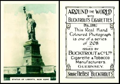
The Statue of Liberty is here because she represents New York. And that was not only the home of Alfred Mosher Butts, it was vital to his research for he chose the make up of the tiles for his game, and their values, by counting the letters used on random pages of the New York Times newspaper.
Vowels were obviously used most, so they had the lowest score, just one point, along with letters L,N,S,T, and R. And some letters would sometimes not appear on a page at all, so they became the most valuable scorers - five points being given to "K", eight to "J" and "X", and ten for the least used of all, which were "Q" and "Z". Then there were two blank tiles, so that the game did not reach stalemate too easily - these would allow you to make them any letter you chose, but they would not score you any points at all.
Now this set is one of a larger group, and, at the moment, this is the earliest of those sets here, so it will be given the full description. Later on, when I use set one, it will change.
Lets start our card chat with our British American Tobacco book, the original RB.21, where this set has a slightly different date in the index by firms, of 1926-7, and also a different group title, of "Photographic Views".
In the main body it appears under Section XIII, Group 4 - Guernsey Local Issues, and the text is :
289. PHOTOGRAPHIC VIEWS. Size 66 x 47 m/m. Fronts matt photoprints, hand coloured. Backs in black, inscribed "This Real Hand-Coloured Photograph is one of a series of ... " with Bucktrout`s name and address at base. Bucktrout issues. Four numbered series, each of 104 subjects.
289.1 Set 1 Titled "Places of Interest." Numbered 1-104
289.2 Set 2 Titled "Around the World" Numbered 105-208
289.3 Set 3 Titled "Around the World" Numbered 209-312
289.4 Set 4 Titled "Around the World" Numbered 313-416
The links, underlined in blue, lead you to the entries for those other parts of the set, which are shown elsewhere on this site.
Now I am not sure why set 1 was titled "Places of Interest", whilst all the rest were titled "Around the World". Some may tell you that this is because that set is purely views of the British Isles, but it is not, there are Foreign sights in there as well.
Another curious thing is that all the cards say, on the reverse, "a series of ....", but they differ in the number - the first set saying "a series of 104", the second "....of 208" etc.
Finally, I also think that having sets of a hundred and four cards is a very odd way of going about things, why not an even hundred?
Anyway our World Tobacco Issues Indexes list this set with a header that tells us that Bucktrout was a Guernsey associate of British American Tobacco through Guernsey Tobacco Co., and that the cards were issued between 1919 and 1929 with brands such as Islanders, Fags, Specials and Clubs, as well as anonymously with wording relating to "Guernsey-made Cigarettes".
The set is described in both as :
AROUND THE WORLD or PLACES OF INTEREST. Md. 66 x 48. Hand-coloured photos. See RB.21/289. Special album issued.
1. Nd. 1/104. Titled "Places of Interest" (104)
2. Nd. 105/208. Titled "Around the World" (104)
3. Nd. 209/312. Titled "Around the World" (104)
4. Nd. 313/416. Titled "Around the World" (104)
The intriguing thing is that on investigation Guernsey Tobacco issued cigarette cards too, in the mid 1930s, these being three of the W.D. & H.O. Wills "A Famous Picture" sectional series ("And When Did You Last See Your Father?", "The Laughing Cavalier" and "The Toast" - but not "Between Two Fires", "Mother and Son" or "The Boyhood of Raleigh") and a set of fifty three miniature playing cards including a joker.
Monday, 8th April 2024
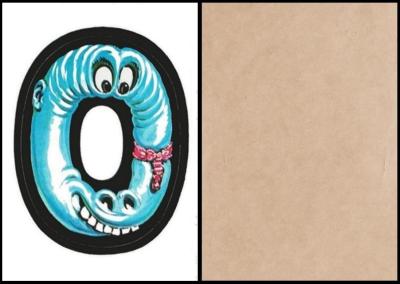
I thought it would be a bit of a challenge for the rest of this week to find cards that only showed single letters, like the ones on the scrabble tiles.
This one is a bit anthropomorphic, but its fun, and not too creepy, like some of the cards in this set. And even better we have not had it before !
This set was definitely one of the favourites of all the collectors I asked, though it is basically just letters of the alphabet. However, they are amazingly enhanced by a variety of men and monsters, which were dreamed up and constructed by none other than Norman Saunders.
In case you are wondering how letters of the alphabet result in forty eight cards, the answer is that there are different sorts of cards within the set. Some of them like ours, have a large initial filling the card, but not only letters, there are also numbers one to nine, and symbols of an exclamation mark, a question mark, an "&" or ampersand, a dollar, and a cent. Then the other twenty-two cards each had four quarter-sized letters, numbers and symbols.
Lovers of the set will also take great pleasure in telling you that these quarter-size miniatures were not just straight copies, reduced - they were in fact repainted, by Mr. Saunders, by hand, and careful examination will reveal that there are differences, if you take the time to look.
The cards came with bubble gum, so they are proper trade cards - and they originally cost just five cents a pack
Tuesday, 9th April 2024
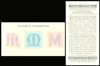
Now this is a curious item that is looks as if it is the wrong way round. That is because it is a transfer, and like all transfers, it was intended to be moistened and slid off on to whatever you liked as decoration.
Several other sets of transfer cards were issued by Player at around this time, starting with "Wild Animals Heads". The full list of issues was
- Wild Animals Heads (January 1931)
- Dogs – full length (September 1931)
- Poultry (December 1931)
- Butterflies (March 1932)
- Wild Birds (October 1932)
- Boy Scout & Girl Guide Patrol Signs and Emblems (January 1933)
- Derby & Grand National Winners (April 1933)
- Aviary and Cage Birds (August 1933)
There was also a plan to issue a set of transfers of “Irish Place Names”, but they were never produced, though they do exist, as fronts with plain backs. It is possible these are proofs, because they appear in the updated World Tobacco Issues Index as being “not studied”. If you own these, or know someone who does, do get in touch so that we may show one to our readers. And remember you can do this quite anonymously, just between you and me, with your name simply being recorded as “A Reader”.
For all of these above sets, even the “Irish Place Names”, a set of actual cards, with exactly the same fronts, was issued, and it appears that both the card version and the transfer version were circulated within the packets at the same time, so that in effect you were making up two sets at once. However, our set was only ever issued as the transfers, never as cards. I do not know why this was, because in October of the same year, when they issued the transfers of “Wild Birds”, it was once more issued in conjunction with an identical set of “Wild Birds” cards.
Now for the really curious thing, though, because our set actually was issued at the same time as a set of proper cards,they were just not of “Your Initials. This is something which is only revealed by our original John Player reference book RB.17, issued in 1950, which reads :
204. 26. YOUR INITIALS Complete Alphabet in Three Designs. Small transfers, issued with DANDIES, see item 68-A. Fronts in colour. Backs in grey, with instructions for use. Home issue. July 1932. The same cards were circulated in Ireland in December, 1932.
The “Dandies” listing reads : “A. 50 Small cards. Issued July, 1932, accompanied by transfers “Your Initials” – see item 204.”
This information was not carried forward into our original World Tobacco Issues Index, however, and the listing of our set there simply reads :
YOUR INITIALS. Sm. Transfers. Unnd. Complete alphabet. (26)
There is no mention in the “Dandies” listing either. And nor does it appear in our updated World Tobacco Issues Index, which means that many of our readers may only be discovering this fact for the first time today
Wednesday, 10th April 2024
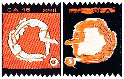
Lots of gaps to fill in with this one, so do help if you can.
Now it first appears at the back of in our original World Tobacco Issues Index, as part of a group, which is catalogued as :
SPORTING FIGURES (A). Sm., serrated top and bottom. Woven in colour on black material See X50/13.
1. Size 50-55 x 40. Nd. CA 1 – CA-26 (26). Even numbers with red, odd numbers with blue backgrounds.
2. Size 45 x 30. No. B 8 seen
However in our updated World Tobacco Issues Index it is alone, and the text slightly altered, to :
SPORTING FIGURES I (A). Sm. 50-55 x 40. Serrated top and bottom. Woven in colour on black material. Nd. CA1 – CA25 (25), representing letters of the alphabet, omitting “I”. Even numbers with red, odd numbers with blue backgrounds. Additional numbers to 29, with face masks in lavender and/or silver on black background, have also been seen.
So the first question has to be regarding the number in the set, which started as twenty-six and was then reduced to twenty-five. And what happened to the “I”? Excluding that “I” is somewhat odd, it being a vowel; most people, given the choice, would choose to lose the “J”, which looks similar but has much less usage - though some people counter that the “J” is a more important capital letter, if these silks were intended to be sewn on to form names.
Secondly, who issued these? One name that has been attached to them is the Turkish-Macedonian Tobacco Company, or “Turmac”. They were based in Holland, with branches in Constantinople, Cavalla, Brussels, Amsterdam, Zurich, London and Paris. And yet nobody has tied this set to them yet.
If you look about where the set appears in the updated World Tobacco Issues Index there seems to be another contender, and that is Kiazim Emin. This company does not appear in the original World Tobacco Issues Index, but they were based in Amsterdam too, and most tellingly, the other set, originally grouped with our one, has become separately listed, as :
SPORTING FIGURES II (A). Sm. 75 x 51. No scenery background. Similar in style to ZS04-740, three colours only. Unnd. (5 seen). Probably issued by Kiazim Emin.
By the way ZS04-740 is catalogued as :
SPORT AND NATURE SERIES (A). Sm. 70-75 x 50, serrated top and bottom. Many nature subjects are also found in a smaller size 65 x 51. Woven in colour on black material. Without captions. Unnd (126 - 55 sport and scouting, 37 animals 34 flowers). Issued by Kiazim Emin. Special album issued, entitled “Sport en Natuur”.
That seems to make them front runners for the issuer of this set too
Thursday, 11th April 2024
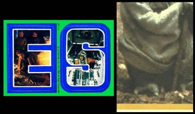
Bear with me, for this is slightly confusing, unless you are into Star Wars.
Star Wars cards are actually split into many series, but for many collectors it comes down to "The Originals", which are the films released first in 1977 (!Star Wars", 1980 ("The Empire Strikes Back" and 1981 ("The Return of the Jedi") and the later films which had different actors. Confusingly the second three films dealt with a time before the originals took place, and then the third three carried on the tale after the originals were over.
These stickers were for the second original film, "The Empire Strikes Back", and there were three series issued. Luckily the sticker borders are in different colours, so we can tell them apart, series one being yellow, series two blue, and series three green.
They were not long sets, series one and two being of thirty-three cards, and series three being just twenty-two. All had alphabet letters, but the first two series had twenty-two of these, in a variety of combinations, then there were eleven stickers shaped as characters from the film. Whilst our set was just the twenty two letter stickers, and no characters.
The packets were twenty-five cents each. And they contained bubble gum, so we are still amongst the trade cards rather than the commercial. The stickers and the cards were placed inside the packets at a ratio of "12 Movie Photo Cards, I sticker, 1 stick bubble gum".
The stickers were slightly more popular with younger collectors, who used them for the purpose for which they were intended, by removing the sticker, fixing it to something they believed it would enhance, and throwing the back away. Therefore the stickers, today, are scarcer.
Now whilst looking at some other Star Wars cards I have discovered that this set does actually appear in our vintage British Trade Index part III - where it is described as :
Initial Stickers - The Empire Strikes Back (A). 89 x 64. Back with sectional picture. Front inscribed "Lucas, Ltd. (LFL) 1980. All Rights Reserved". Nd. 67/88 (22) As same numbers in set TO6-8 in RB.30
That RB.30 is our original Australian and New Zealand Index, and this entry, TO6-8, is for the cards, which are catalogued as :
The Empire Strikes Back. 89 x 64. Nd. (132). Nos. 131/132 inscribed "Topps Presents - Star Wars - The Empire Strikes Back", other numbers anonymous. Issued in U.S.A.
Friday, 12th April 2024
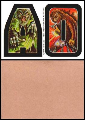
So here we have a card which may be rather sought after if it was sold billed as the first appearance of "Godzilla vs Kong" - and shown to people who had just gone to see the brand new movie about the duo. Strange how things turn full circle.
Though in truth by the time this card was released the two had already been teamed up, in "King Kong vs Godzilla", a Japanese film released in 1962.
King Kong came first in 1933, he is ostensibly a gorilla, who lived quite peacefully on an island of giant animals and/or dinosaurs, until an American film crew come along and kidnap him so that he can be exhibited in New York. Oddly he first appeared in a novelisation of the film, the actual film being released afterwards. He has only made thirteen films in total though, whereas Godzilla first appeared much later, in 1954, and has already made thirty-eight films in total, thirty three of which were Japanese. He is a prehistoric reptile, woken up by an American nuclear bomb, which served not to kill him but to enhance his powers.
As far as card appearances go, King Kong is generally regarded to have been first shown on an unnumbered card as part of Leaf Gum`s 1961 "Spook Stories" stickers. However he is blue, and rather more of a large prehistoric man, though he is holding a tiny blonde lady in his hand, much as King Kong held Fay Wray in the movie. The first where he is billed as King Kong is in the same year, on card 3 of Nu-Cards` "Horror Monster Series".
Godzilla`s first appearance was in 1965, on card 17 of Donruss` "King Kong", though he does appear on several later cards within the same set.
Now our set of cards are not all actual named monsters, though you will find Frankenstein`s Monster, The Phantom of the Opera and Jekyll and Hyde. The others are un-named devils, ghosts, hands, snakes, vampires, werewolves and zombies. The set was issued between 1973 and 1974, and it follows the same pattern as Topps` earlier "Nutty Initials" (issued in 1967) and "Love Initials" (issued in 1970), a plain background on which is a heavily bordered initial, or more than one. The sticker is the initial, but the peel line is in the middle of the thick border, you simply lifted it with your fingernail, stuck it on, and, uncaring of collectors future, discarded the part of the card that was left behind, especially if it had only got a plain back.
Do note that the cards say "TOPPS CHEWING GUM INC" down the centre, but the counter box definitely says "Monster Initial Bubble Gum Stickers" and the wax wrappers agree, all saying "Monster Initial Stickers - with 1 stick Bubble Gum".
In addition, you can find the cards with pinky brown backs and white ones, and there is a difference in the way that they were distributed, the white ones only being issued in packs of three and the pinky brown ones in packs of four. Some collectors have the opinion that the white card was better quality and hence cost more to make, and that was why there were less cards in those packets.
Now some of those cards featured a puzzle, the fronts being a section of the picture only in full colour, and the backs being the whole puzzle in black and white. We will feature those in the future, and link back to here.
UPDATED 14 APRIL 2024 - Now originally I linked to a partial checklist at Jeff Allender`s NS Lists website. However I was then contacted by reader John Levitt, who said that the Non Sport Update Magazine - Card Talk Section reported about a year ago that Mr. Allender`s web-site has not been updated since June 2020. Therefore a better source is BubbleGumCards/MonsterInitials - where you will also find some of the original artwork for this set, as well as a chance to see how your name would appear in Monster Initials (just scroll down the page for that).
They also agree that this set was drawn by Augie Napoli, though they do call him "one of the artists". He died in 1994, but there is some of his work shown at Joseph Napoli`s website, who may perhaps be his son. I will try and find out.
and there I must halt, it is already Saturday. A whole weekend spreads out before me. How shall I fill that?
Now next week, in case you had forgotten, our newsletter will arrive just as you are waking up and getting ready for our 2024 annual card fair and convention at the Five Rivers Leisure Centre, Hulse Road, Salisbury, Wiltshire SP1 3NR.
Make sure you have your card wants lists, and also check on your need for any larger items like albums, and leaves, or books, for buying those in person at the event will save you paying postage.
And the newsletter will act as your virtual reveille!
