Weekend again, and there is getting a chill to the air, but don`t lie abed, get out and go do something more interesting - a fair, a market, a walk round the shops to look at the Christmas decorations, a slow walk round your local town, where many discoveries can be made when you do not have to be anywhere else in a hurry, and can meander.
This newsletter has been one of those where I struggled, with dates, and with cards, and then I lost the list of dates and notes which I had been writing - however all is sorted now, and I am happy enough.
So, without further ado, may I present a glimpse into the future, a momentous victory, the birth of a regiment, a sad defeat, a musical spin off, some monetary security, and a trip to the South Pole

Impel Marketing Inc. [trade/commercial : cards : O/S - USA] "Terminator 2 : Judgment Day" (1991) 2/140
Our glimpse into the future was rather a scary one, for today in 1984 saw the release of the film "The Terminator". But we cannot show you a card of that because it seems that there were no tie in cards ever issued - hence this card comes from the follow up film, "Terminator 2", which was not released until 1991.
As to why there were no cards for the first film, your guess is as good as mine. Especially as adding names of films to cards showing actors had been going on for decades, and movie tie-in cards were nothing new. I personally wonder, however, if the real reason for this was that the film, or at least the cinema version, was not designed for children, and had an "R" rating (equivalent to our "X" or "18"). Though this does not really explain how the second film, with the same rating, did have cards.
The plot of the film was that a cyborg, posing as a human, is sent back in time to stop the birth of a child who will, in the future, fight back against a new system of artificial intelligence with designs on ruling the world and save humanity in every way. The plan was to terminate the mother before she ever gets to have a child, hence the title of the film. The twist is that there is a second man, a human, who is sent to save the woman, and he actually ends up fathering the child who saves the world.
It could have been just another sci-fi film, but the cyborg was played by Arnold Schwarzenegger, and that`s pretty much reason enough to watch it, because he is amazing. He was a bodybuilder, cast in a movie called Conan the Barbarian in 1982, and because of that he was cast as The Terminator. In fact, in 1984 he was not only in The Terminator, but in the sequel to his first movie, called Conan the Destroyer.
His earliest cards are all said to be from Conan The Barbarian, though I suspect there may be a bodybuilding one out there somewhere. His next film to appear on cards was another Sci-Fi, called Total Recall, and they were released in 1990 by Pacific. Our cards came along in 1991, and were sold in wax packs containing thirteen cards, twelve base set cards and a special card showing merchandise which you could send away for, though you had to pay for the items, it was in no way a "congratulations you win" kind of card. There were ten different items, ranging from a mug to a pretty nice jacket with Mr. Schwarzenegger as a cyborg on the back. If you really got lucky you could also find a hologram card of him, or another card of the Special Effects Artist Stan Winston (which is a card I cannot describe as I have never seen one).
Now in case you are wondering, yes, Topps did get involved with this film too, but they only issued stickers, a set of 44, which are easily identifiable as they have blue borders to the front. These retailed at 25 cents for a packet of five stickers.
Another company who recorded the film were Artbox, though not until 2003. Their seventy two card set of "Terminator 2 Film Cardz" are not really cards at all, either, but a card frame in which is inserted a kind of film cell, colour on the front and kind of misty to the back. Looks like you had to buy a complete box at a time of those though. Also 2003 saw the arrival of Terminator 3, so they were kind of a bit behind the times.
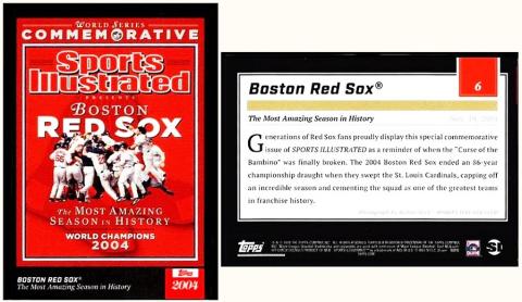
Topps [trade/commercial : cards : O/S - USA] "Topps x Sports Illustrated"
Onwards to our momentous victory, today in 2004, which saw the Boston Red Sox beat the St. Louis Cardinals, and win their ninth World Series - but the last of those times had been all the way back in 1918, when they beat the Chicago Cubs.
As you might imagine, there were plenty of special cards issued to mark this event, and though it did not come out quite as well as I hoped, I have gone for this one, which shows the cover of Sports Illustrated magazine.
At the time of originally writing this, the Boston Red Sox had appeared on 272,719 cards, according to the Trading Card Database/BRS, anyway, and I will not challenge their counting skills. And in 2004, the year of their great victory alone, it says that they were shown on 9,164 cards. They have not always been the Boston Red Sox though, for when they were founded, in 1901, they were regarded as the Boston Americans; they only became the Boston Red Sox in 1908, and they only moved to Fenway Park in 1912. And, amazingly, there are other cards which call them the Boston Americans, from an unnumbered set issued with caramels by The Breisch-Williams Co., Inc., Oxford, Pennsylvania in 1903 and 1904, which Jefferson Burdick catalogued as E.107. You can see them at the Trading Card Database/BWB - and over the weekend I will try to find out a bit more about them.
This card shows the cover of Sports Illustrated from 11/10/04, though the actual magazine also tells us that it was to remain on sale until 1/31/05, which means that there will be more of them about in the future than if it was a standard weekly issue.
It comes from a very interesting set, which was a team-up with Sports Illustrated magazine, in order to celebrate the seventieth anniversary of Topps. Then it gets a bit confusing to me, because it says that the cards were issued every week, two at a time, starting on March the 16th 2021, and you could buy each pair for $17.99, or singles, if you preferred, for $9.99. This sounds like the cards were virtual ones, and yet they were not.
If anyone would like to tell me more about this, please do!
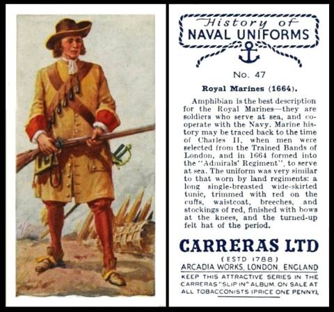
Carreras Ltd [tobacco : UK - London] "History of Naval Uniforms" (September 1937) 47/50 - C151-320 : C18-56
Lets timeslip now, to today in 1664, when the Duke of York and Albany`s Maritime Regiment of Foot was founded. Now it might sound odd to have a foot regiment at sea, but it made a lot of sense, giving a two pronged attack as it were, giving men who sailed across, repelling all boarders as it were, and other men who disembarked and had skills at fighting on land. Also, at that time, we were at war with Holland, a very flat area of the globe, where there is a mixture of land and water right along the coast.
However we were not alone in this sort of fighting force, for there were others, across Europe, including the famed Infanteria de Marina, of Spain, which had been formed over a hundred years before ours, in 1537.
And if you think about the name of that Spanish force, it almost certainly provided the origin of the "Royal Marines", which was the eventual descendant of our force, being named as that in 1802. On which note I must remind you that there is quite a scarce card of the Royal Marines as Lot 86 in this time`s Society Auction, described as " Type ENTERPRISE TOBACCO Types of the British Army no. 9. Faint crease o/w VG". This has the estimate of £35-40
The initial headcount of our Regiment was some twelve hundred men, hand picked, for a variety of reasons and skills. And then, quite soon after, it became The Admiral`s Regiment, as it is called on this card.
Sadly though this card does not our Regiment, and nor does it the Duke of York and Albany, who was actually the brother of King Charles II, called James, who was pretty important, as he was later to become both King James II of England and King James VII of Scotland.
This set is the accompaniment for another of Carreras` sets, called "History of Army Uniforms" which was issued just before it, in June 1937, though the top of the reverse of that one is different, being a banner across a shield, whereas ours has an anchor and ropes. We featured that set in our newsletter of the 16th of March, 2024, and on that first day, which was a Saturday, so there is not much scrolling involved to find it.
Our set is described in our World Tobacco Issues Indexes as just :
HISTORY OF NAVAL UNIFORMS. Sm. Nd. (50)
And the Army version`s listing follows the same pattern as this, just with that one word replaced
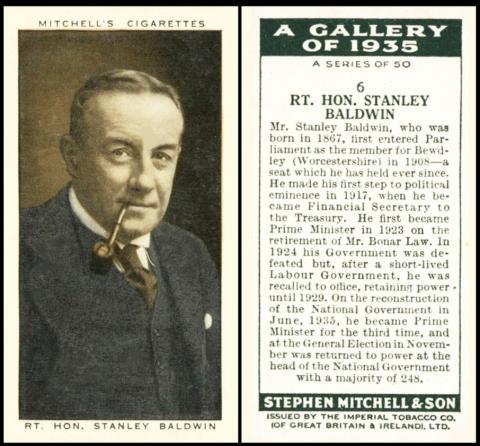
Stephen Mitchell & Son [tobacco : UK - Glasgow] "A Gallery of 1935" (1936) 6/50 - M122-34
To a centenary now, and quite a sad one, for after the excitement of the first ever Labour Government, they were voted out today in 1924, on a vote of no confidence, and this saw the Conservatives regain control. This is rather matter of factly mentioned on our card as "In 1924 his Government was defeated but, after a short lived Labour Government, he was recalled to office..."
There are many reasons for this defeat. Firstly, a new parliament does have their backs against the wall as it were, for they have to both sort out the failings of the party that was voted out, and attempt to find time to fulfil the promises which saw them elected. If they do not do this quickly, then discontent and grumbling ensues.
However in this case, there was a bit of foul play, a letter, a complete forgery, which was published as fact in the Daily Mail, which was and remains a Conservative-leaning newspaper, and more than that, which appeared just four days before the country went to the polls. The gist of this was that this letter had been intercepted as it travelled from the supposed author, Grigory Zinoviev, the head of Communist International in Moscow, to the recipient, the Communist Party of Great Britain - the contents of which urged the Party to spread dissent amongst the working classes and unemployed so that when the Labour Party started to forge closer links between Russia and Britain, and to ratify the Russian Treaty, these people would not take much swaying to form part of the Revolution against the British way of life, and see Communism come to it instead. Also there were instructions for how to train troops and leaders for that inevitable battle, which was even described as an Armed Revolution. To us today this seems to be yet another case of the conservatives continual fear of the Labour left wing, but at the time there was indeed much unemployment, and desire for change, and Communism did not seem to be such a bad thing, and Russia had even fought with us against the Axis powers, and right from the start of the War, too. So you can see how this letter did indeed rally the conservatives to action, and see them voting in their droves.
Nobody has ever found our where the letter came from, nor who wrote it, though even before the election both the Russian Embassy in London and the Russian Government were adamant that it was nothing to do with them, and the latter demanded an apology from Britain, three days before the election, for printing what they openly called "a forged letter". But the damage was done and the Labour Party did indeed pay the price at polling.
I am surprised that there were but two of these galleries, a 1934 and a 1935, for they show the personalities of the age in kind of colour, something that must have provided endless discussion for adults, though there almost certainly was not so much of interest to children. I think the fact that they were not very colourful is also a hint of this.
Our set is described in our original World Tobacco Issues Index as :
A GALLERY OF 1935. Sm. Lightly coloured. Nd. (50). ... M122-34
There was no album for this set - though there was for the 1934 version.
As for who was in the gallery, you can find a checklist at Immortal Ephemera/1935.
As for the other, earlier set, that was featured as our Card of the Day for the 2nd of June 2022, and a link to the checklist of those appears there too.
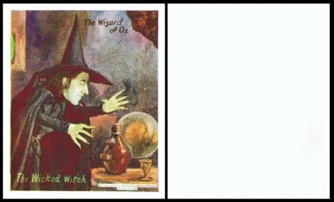
Barratt & Co. Ltd [trade : confectionery : UK - Wood Green, London] "The Wizard of Oz" / "Characters from Fairy Stories and Fiction" (1940) BAR-880 : HB-82 : ZJ5-45.2
A bit of fun now, albeit "Wicked". In case you have not come across this musical before, it is not just a play about witches, it is actually a prequel to the Wizard of Oz, from the point of view of the witches. So we have Galinda who is blonde and pretty and becomes the good witch, losing her first "A" in the process, and Elphaba, who is mocked for her green skin, and becomes the wicked witch.
In a curious twist, Elphaba turns out to be braver and also more honest than Glinda, for it is she who tries to expose that the Wizard of Oz is not only just a simple man pretending to be something he is not, but he wants to steal the voices of all the animals. Indeed, purely in the process of her bravery, and her stand against corruption, he manages to turn the other inhabitants against her and make her known as the Wicked Witch, whilst the Good Witch stood meekly by.
It`s a great idea, and a very fun musical. And it is now a film, with Cynthia Erivo as Elphaba and Ariana Grande as Glinda - plus Jeff Goldblum as the Wizard of Oz.
This set is amazing and yet few people know of it, even the many collectors of Wizard of Oz memorabilia. I can understand this because I took completely ages to find it, buried away in the original British Trade Index under the plain back "Z" issues, and even then interred within a set called "Characters from Fairy Stories and Fiction", which is an adopted, but rather clunky title.
That first listing, for the entire group, in the original British Trade Index part I, contains listings of all the cards in the set. However we will only include that for our set. The listing reads :
SET ZJ5-45. CHARACTERS FROM FAIRY STORIES AND FICTION (A). Md. Front per Fig. ZJ5-45. Unnd. Issued by Barratt. ... ZJ5-45
1. Titled "Gullivers Travels". Size 64 x 53. Front (a) matt (b) varnished. White borders. (12)
2. Titled "The Wizard of Oz". Size 64 x 53, with white borders, or cut to 60 x 49, cutting usually eliminating white borders. Front (a) matt (b) varnished. (12)
1. The Cowardly Lion
2. Dorothy & Dog Toto
3. Dorothy is carried by Gelon? to Oz
4. Dorothy wakens and sees Aunt Em
5. Glinda - the good witch
6. The Mayor of the Munchkin Land
7. The Scarecrow
8. The Tin Woodman
9. The Wicked Witch
10. The Winged Monkey
11. Wizard of Oz
12. The Wizard of Oz returns to Kansas in his balloon3. Without series title. "Pinocchio". (a) Size 64 x 48, with white borders (b) Size 60 x 48, cutting usually eliminating white borders. (12)
4. Without series title. "Snow White and the Seven Dwarfs". Size 64 x 53. Mauve-grey borders. (36)
5. Other cards without series title. Includes "Mickey Mouse" and "Silly Symphony". Size 64 x 53. 50 subjects, of which selections issued in five different forms. }
1. Mauve-grey borders.
A. Normal board, not die cut.
(a) Front unvarnished. 12 known - Nos 6, 10, 11, 13/15. 18, 22, 30, 37, 43 and 50
(b) Front varnished/ 12 known - Nos. 6, 10/15, 18, 37. 43, 46 and 50
2. Front without borders. Few known with one border, or traces of border.
B. Normal board, die cut for jig-saw puzzle. 11 known - Nos. 3, 17, 21, 27/29, 34, 36, 39, 42 and 44
C. Thin board, not die-cut. 6 known - Nos. 9, 16, 19, 33, 37 and 48
D. Thin board, die-cut to stand out. 24 known - Nos. 1, 5, 8 17, 19/21, 23/29, 31, 33, 35/40, 44 and 47
E. Paper, die-cut to stand out. 32 known - Nos. 1/5, 7/9, 16, 19, 21, 23/29, 31, 32, 34/36 38/42, 44, 45, 47 and 49.
Now our book, The Wonderful Wizard of Oz, was published in 1900, so it seems more likely that this set was designed to tie in with the film version, starring Judy Garland, released in 1939. However this was not the first time it was turned into a film, that happened in March 1910, and it was a silent version with Bebe Daniels as Dorothy. It is also notable because the Wicked Witch of the West is featured more heavily in this version. And it had also been turned into a stage musical, in 1902.
The other sets could well also be based on films - Disney`s "Snow White" having been released in 1937, and his "Pinocchio" in 1940 - and "Gulliver`s Travels", released in 1939 by Max Fleischer.
The weak link here is the last group, and from the outset I thought these earlier - Disney`s "Silly Symphonies" are much older, starting in 1929, though they were still being released in 1939. And as for Mickey Mouse, he might have born in 1928, but he was in the news in 1940, because that saw the release of "Fantasia". However the list of subjects given for that set do not tie in with this film.
This is backed up by our updated British Trade Index, which had them under Barratt but splits them up, and has the last part of this listing separately, as :
CHARACTERS FROM FAIRY STORIES AND FICTION (A). 1937-39. Includes "Mickey Mouse" and "Silly Symphony".64 x 53. Unnd. (53 known) issued variously with and without mauve-grey borders, die cut and not die cut, on board thick and thin, and on paper. See HB-16.
The other sets are listed all on their ownsome, ours being catalogued as :
THE WIZARD OF OZ. 64 x 53, with white borders, or cut to 60 x 49, usually eliminating borders. Front (a) matt (b) varnished. Unnd. (12). See HB-82. Anonymous ... BAR-880
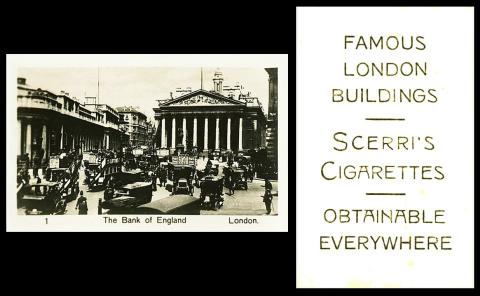
John Scerri [tobacco : O/S - Malta] "Famous London Buildings" (1931) 1/50 - S147-300 : S32-5
This was the day that caused me all the angst, I started it with Juliet Gordon Low, the founder of the Girl Scouts of America but could not find a single card of her or of a Girl Scout, save a Canadian Girl Scout issued by Cope, from a set we used already.
So we ended up with the Bank of England, late on Friday night, simply because I stumbled on the fact that today in 1924 "World Savings Day" came into being. This was announced on the 31st of October, at the first International Savings Bank Congress, in Milan, Italy, and though they originally called it World Thrift Day, the general public seem to have renamed it. It was later changed to the 30th of October, not sure why - and also it is not the same date every year, because the plan was that everyone, wherever they were situated, should go to the bank on that day and deposit any money that they had laying about unused. So it has to be on a date where the banks are open, and that there are no public holidays - this means that where there are different public holidays, on a regional basis, the date could be different to the rest of the World.
The idea of saving is a good one, and it is designed to provide us with a sum of money to support us when times get tough, or when we leave work for retirement. However the truth is that those in most need of those things are the least likely to be able to save at all, their money is needed every day just to keep them alive. And the people who can put away nice sums of money for their retirement are those who almost certainly need it least.
As for the Bank of England, this is actually the main bank, and gold storage unit, of the United Kingdom, or at least of its government, and it was the first bank in this country. It began in 1694, which was quite late, for the Banca Monte dei Paschi di Siena, in Italy, was founded in 1624, and can trace its lineage back to the 1470s. Strangely, the Bank of England was a private bank right until 1946 when it was nationalised by Clement Attlee, the Labour Prime Minister from 1945 to 1951. Today it is what is known, rather confusingly, as an Independent Public Organisation, owned by the Treasury, or at least by the Treasury Solicitor - albeit on behalf of the government, whichsoever party is in power.
This set is quite a scarce one, though its sepia companion, "World`s Famous Buildings", issued in the same year as ours, seems quite plentiful. And there are a hundred cards in that set, double ours!
Our set is described in our original World Tobacco Issues Index as :
FAMOUS LONDON BUILDINGS. Sm. 65 x 41-43. Black and white photos. Nd. (50) ... S32-5
The text is the same in our updated version, but it has a new code, of S147-300.
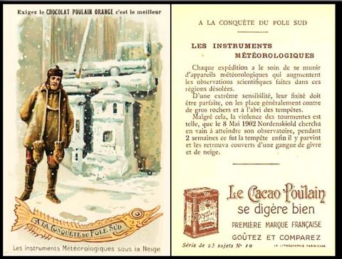
Chocolat Poulain [trade : chocolate : O/S - France] "A La Conquete de Pole-Sud" / "The Conquest of the South Pole" (1912) 10/25
This card was not really what I wanted either, but there is a connection, of sorts, because today in 1924, for our fourth Centenary event of the week, the Royal Air Force introduced a meteorological flight as part of Coastal Command, the idea of which was to record the weather on a day to day basis. I failed to find this on cards, despite the fact that the first Meteorological Office outstation was based at R.A.F. Benson in 1914. At that time they primarily looked for thunderstorms and fogs. but they eventually developed the skills to predict when it would be possible for either side to launch bombing or reconnaisance flights, or to use poison gas.
We also know that many early civilisations, especially the Babylonians, used the weather to predict events and to plan battles and wars, delaying or advancing their actions depending on what the clouds told them.
Anyway none of this got me any closer to a card for that subject, but I did find that the systems of recording meteorological information was also, unsurprisingly, used on geographical expeditions. That was also true back through the centuries, especially at sea, and indeed The Meteorolgical Office was only founded, in 1854, to improve the training in and the understanding of maritime meteorology. And it was founded by Rear Admiral Robert FitzRoy, an ex-Naval Officer, who would have thoroughly applauded the fact that many of its earliest, as well as its later experiments were also conducted as part of such expeditions - they even loaned a range of their equipment to Sir Ernest Shackleton for his Antarctic Exploration.
Now this story turned out to be quite fascinating, because the text on this card mentions 1902, and in that year a team including the giants of exploration Robert Falcon Scott, Edward Wilson, and the aforementioned Ernest Shackleton did travel to the South Pole, but never reached it - they were forced to go back to base through a variety of reasons.
The key to the picture on this card is one word, rather buried in the text, and that is Nordenskiold. Now at first this led me to a Nils Adolf Erik Nordenskiold, born on the 18th of November 1832, in Finland, to an aristocratic lineage, holding the equivalent of our title Baron, and also, much later, becoming a member of the Swedish parliament. However, he was also a brilliant scientist, specialising in geology, and he was, unsurprisingly, asked to take part in a geological expedition to Spitzbergen. This led to four visits to the Arctic in the 1860s and 1870s, during which it was first suggested that he attempt to complete the North East Passage, which he did indeed do - in 1878 to 1879. But he died on 12 August 1901 and this card says 8 Mai 1902.
So back to the books and I found a Doctor Otto Nordenskjold, with a J not an I. The two men are, very strangely, related - Adolf Erik Nordenskiold being Otto Nordenkjold`s uncle. He was also a geologist, but born in Sweden. And in 1901 he sailed from Gothenburg to Argentina. The journey, aboard the ship Antarctic, took two months, and then it took another month to reach the Antarctic. Their first job was to build what is described as a small observatory, which also served as shelter. This could well be what is shown on this card, because if you look behind the silver equipage there is a wooden construction, of beams, and perhaps canvas. though it does not seem to afford much shelter. The ship sailed away, to the Falklands, leaving a smaller party of men behind, and then it was to return next spring. Neither party had much luck, as our card says, "on the 8th of May, 1902, our man searched in vain for his observatory, for two weeks, before he finally found it under the cover of snow". As far as the ship, on the journey to collect those men, it was trapped in ice and squeezed until it sank. The crew were shipwrecked and managed to get to Paulet Island, where they also constructed a small shelter. The two parties did not meet up again until November 1903, when the authorities had become concerned at the lack of contact and had sent a second ship to investigate.
Now I have not seen enough of this set to be able to tell you of its make up, but I do know that card 20 mentions The Discovery, who took part in Captain Falcon Scott`s 1901 British National Antarctic Expedition. And that card 13 shows The Francaise, commanded by Jean-Baptiste Charcot between 1904 and 1907. On which note, and strangely, both our expedition and the one in 1904 involved the Argentine Navy`s ship called "Uruguay" - it was that second ship which rescued our men, and it also gave support to the Francaise.
This week's Cards of the Day...
This week, with autumn closing in, and some of us griping slightly about the wet and the cold we are going to remind you that as the leaves turn they become at their most beautiful, with many varied hues that you would be hard pressed to capture by painting or drawing them.
The inspiration for this thought is that on the 22nd of October, the same date every year, it is #NationalColorDay. And we hope that you will take the time to think about how to bring colour into your world, whether that be by the means of television, the internet, differently coloured fruit, and other foodstuffs, and even by taking more time to look outside your windows.
We chose to illustrate the colours of the rainbow, and, for the most part, show you the most colourful card we could find within the time allotted to search. We hope that you enjoyed them, and that they brightened your day.
Saturday, 19th October 2024
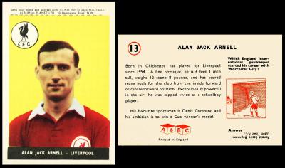
We started our trip through the paintbox of cartophily with this card, on which we, coincidentally, have the first two colours of the rainbow - red, because this is Liverpool Football Club, known as "The Reds" - and yellow, used as the rather lurid backdrop behind our footballer.
Lets start with those reds, though, because at first Liverpool played in a curious combination of a shirt split in half, blue and cream, and the sleeve to each side was in the opposing colour. However the tale of how Liverpool F.C. came about is equally odd. You see, at one time, in 1886, Liverpool`s football team, and the only one, was Everton, and they played at a ground called Anfield. However, in 1892, the owner of that ground got a bit, shall I say, greedy, and raised the rent - by £150 a year. So Everton left, and found a new home at Goodison Park. The ground`s owner then had a ground and no team, and probably regretted this, in hindsight, so he started his own team. He hoped to call it Everton, but was unable to buy that name, or to stop the Everton team using it. So he started his own team, called Liverpool, and, for whatever reason, dressed them identically to Everton as well, or at least until 1896, when they changed to wearing red shirts, which they wore with little change until 1955, when a club crest was added to one side of their chest. Though they were not called "The Reds" until Bill Shankly said so, in 1965, and he made them wear red shorts too!
Our footballer today is Alan Jack Arnell, who was born on the 25th of November 1933, in Chichester. On this card he is shown in the Liverpool strip, but he started out with Worthing, and joined Liverpool in December 1953, though the text here tells us that he only started playing for them in 1954. Perhaps the reason for this is that when he joined Liverpool he was still an amateur - he only turned professional in 1954, maybe even just prior to his first Liverpool game.
The really intriguing thing about this card is that it says he was "capped twice as a schoolboy player", yet I cannot find any other reference to that. It also tells us that his "favourite sportsman is Denis Compton" and that "his ambition is to win a cup-winners medal". It does not look like this ever happened, sadly, for during the 1950s Liverpool never made the F.A. Cup final. They were beaten 2-0 by Arsenal in the 1949-50 season, and then did not appear again until 1964-65 when they beat Leeds United 2-1.
He stayed at Liverpool until 1961, and then moved to fourth division Tranmere Rovers. After that he played for Halifax Town and Runcorn. And he died, aged seventy-nine, on 5 May 2013.
The oddest, and perhaps the saddest thing about our man is that he only seems to have ever appeared on one other set, and it was another of A. & B. C. Gum`s - the follow up to this, their 1959-60 "Footballers".
Our card is from the earliest set in the A & B.C. Grouping, issued in 1958. However you would never know this if you looked at our original British Trade Index part II, because here is that listing in full :
If you didn`t find it, dare I say, join the "club" - its well buried, right down in position eight. As to why, I have no idea.That`s not the only problem with this list though, because the cards we show one of as our Card of the Day here are listed as section 8.B, but they were actually the first version to be issued. We know this because that inscription to the front was printed in the top border, and it was to be cut off and sent away to get your album - so the shorter cards listed here as section 8.A.a are only shorter because they have had the top cut off, which only leaves them with three borders, the bottom and the sides.Then, later on, the set was re-issued, in the smaller size, but with four equally sized borders, and without the printing with the album offer. These are set 8.A.b above, and you can see one of those as our Card of the Day for the 7th of December 2024 .
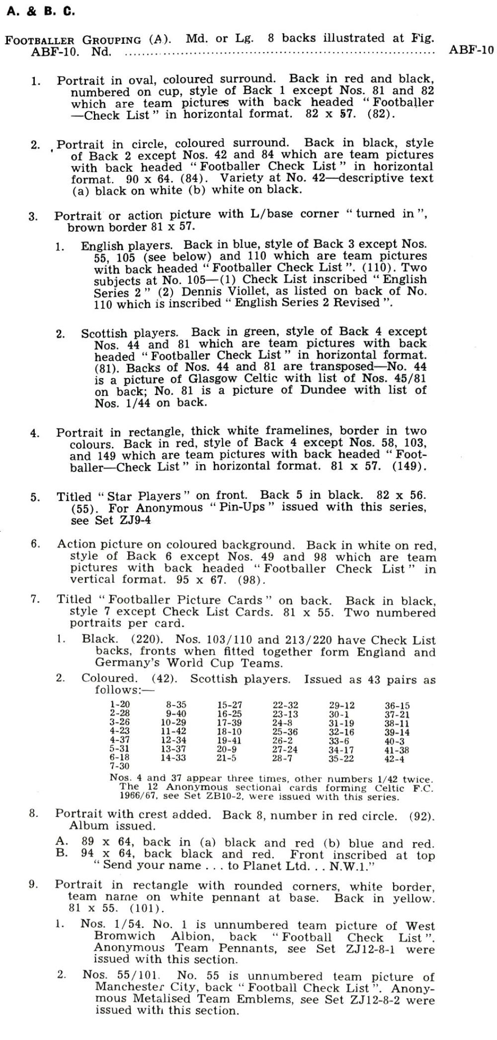
Anyway, as this is the earliest set of A. & B.C. Footballers, and will therefore be the home page for sets one to nine, what follows is (going to be) a really simple checklist, in the order of issue. This will be based on this illustration of the backs, which also appeared in our British Trade Index part II in 1969
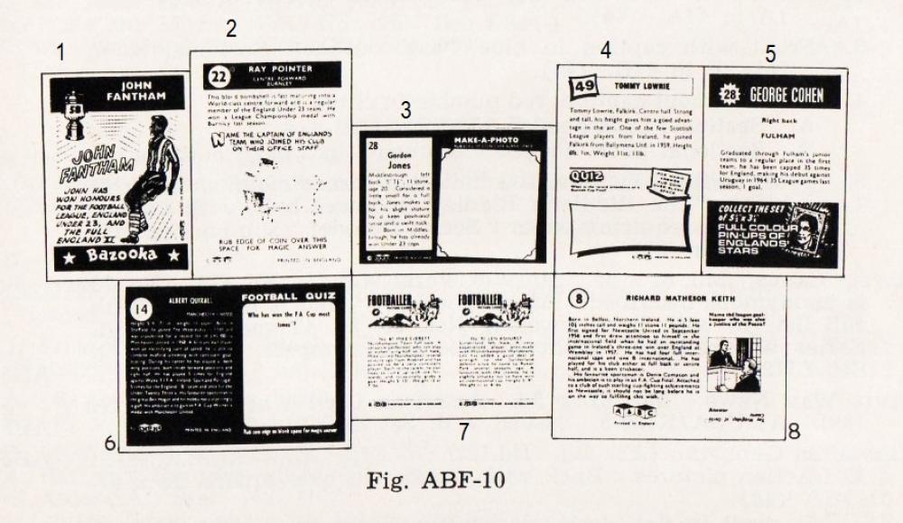
However the numbering of this picture is definitely not as the cards were issued. Also, oddly there were nine sets in the listing, but only eight pictures. This suggests that maybe this illustration was drawn up earlier, before that was issued, and that it possibly first appeared in one of our magazines. If so I will find it when I start the working through and gleaning of those. However it is still a useful tool, and will be more so if used in conjunction with the full listing above, and the simple checklist below, plus the fact that the sets we have featured so far can be accessed simply by clicking the "back" links below :
- Set A - issued 1958-59 - back 8 above - biography to left, cartoon in square box to right
- Set B - issued 1959-60 - back 6 above - biography to left, coin rub "Football Quiz" to right
- Set C - issued 1960-61 - back 2 above - player name at top in black strip, brief biography, coin-rub quiz over bottom three-quarters of card
- Set D - issued in 1962-63 - back 1 above - player name in red box at top, "Bazooka The Chew of Champions in red strip at bottom. cartoon of player in between
- Set E - issued in 1963-64 - back 3 above - player name and biography in slim box left, "Make-A-Photo" on right hand side with mock photo corners -
- Set F - issued 1964-65 - back 4 above - player name and biography at top, "Quiz" below with a curved frame , heavily shadowed to right hand side and bottom.
- Set G - issued 1966-67 - back 7 above - two pictures to front and two biographies to reverse
- Set H - issued 1967 - back 5 above - player name in black strip to top, followed by biography and a black strip offering "full colour pin-ups"
The set which is included in the book but is not on this list is AAB-355 : ABF-10-9, "Footballers" (1968-69), and you can see that as our Card of the Day for the 2nd of September 2023
Now you might think that by the time of our updated British Trade Index, part III, this would all have been sorted out. However it had not, and our set still remains as number 8. The full listing is below, but when compared to the above scanned list it almost seems as if they are different sets, for they seldom use the same way of describing them. Anyway, just to confuse you further, this reads :
ABF-10 Footballer Grouping
1. Portrait in oval. Back of player cards inscribed "Bazooka - The Chew of Champions" (82), Issued 1962-3
2. Portrait in circle. Back of player cards "Rub edge of coin... for Magic Answer". (84). Issued 1960-61, in two batches, 1/42 and 43/84.
3. Backs inscribed "Make a Photo". Issued 1963-4
1. English players, back in blue (110). Issued in two batches, 1/55, 56/100
2. Scottish players, back in green (81)4. Backs inscribed "Quiz". Issued 1964-5
1. English players, back in red (149). Issued in three batches, 1/58, 59/103, 104/149
2. Scottish players, back in green (81)5. Titled "Star Players". (55). Issued 1967, with anonymous set ZJ9-4
6. Action Pictures. (98). Issued 1959-60, in two batches 1/49, 50/98
7. Titled "Football Picture Cards". Issued 1966-67
1. English players. (200). Issued in two batches, 1/110, 111/220 [?]
2. Scottish players. (42). Issued with anonymous set ZB-10-28. Portraits with crest. (92). Issued 1958-59 in two batches 1/46 and 47/92
9. Pictures in rectangle with "rounded" corners. Issued 1968-9
1. English players. (101). Issued in two batches 1/54, 55/101, with anonymous set ZJ12-8.1 and .2
2. Scottish players. (45)
Before I rocket on, the Z numbers amidst this text are carried forward from British Trade Index part II. If you go to the back of British Trade Index III, which would seem to make sense, you will not find them anywhere.
Sunday, 20th October 2024
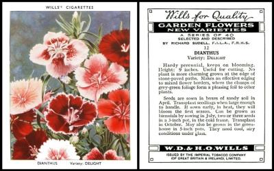
Here we have Dianthus, otherwise known as pinks. This is a very colourful card, though mostly shades of red and pink. And that reminds us that a garden can be made of many colours, but they harmonise together, and complement each other beautifully.
To an artist, pink is made by mixing red with white, and that is all - the more white they add, the lighter the pink results. However the more salmony hues are accomplished with yellow, not white, and the purply end of the spectrum would involve the participation of some blue.
Our flower has many names, starting with Carophyllaceae, which is its Latin family name. Whilst the name of Dianthus comes from a Greek botanist called Theophrastus, born about 371 B.C., and it means divine flower. More normally you will hear it called a Sweet William or Carnation, but its most common name is "Pinks", not for the colour, but for the fact that its frilled edge appears to have been created by using pinking shears, which are a cross between a saw and a pair of scissors and are today much used in crafting, though their original purpose was for either making a decorative hem on clothing, especially childrens, or for cutting certain types of cloth which fray easily when cut straight across with normal scissors. However I have also found reference to the thought that the scissors were named after the edge of the flowers. Further research then told me that the shears were invented in the 1860s and the plant named in the seventeenth century, definitely first.
This set appears in our original W.D. & H.O. Wills reference book part IV as :
GARDEN FLOWERS - New Varieties. By Richard Sudell. Large cards, size 79 x 62 m/m. Fronts printed by letterpress in colour. Backs in grey, with descriptive text. Home issues
223. 40. "A Series of 40". Issued 1938
224. 40. "2nd Series of 40". Issued 1939.
That is shortened in our World Tobacco Issues Indexes, to :
GARDEN FLOWERS - NEW VARIETIES. Lg. Nd.
1.. "A Series of 40".
2. "2nd Series of 40"
The problem with this shortening is that it also removes the reference to Richard Sudell and so there is often confusion with a standard sized set called "Garden Flowers by Richard Sudell" in 1939.
Monday, 21st October 2024
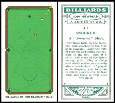
So to close out our clue cards, here is the green baize on a billiard table, and it also provides the main colour on the card. Not just that, but on all the cards in this series.
Some readers, therefore, may imagine this to be one of the most boring sets ever, whilst others may be thrilled to see it. I quite like it, and it also records the rise of the sport, for the first ever Professional Championship of Snooker was held in 1927. This was won by Joe Davis, who was both a professional billiards player, and the owner of a billiard hall premises. He also laid the groundwork for that contest.
In 1928, the year our set was issued, Joe Davis both retained his snooker title, and also won the Professional Billiards Championships. One of the other competitors was a man called Tom Newman, who also played both sports. In fact Alexander Boguslavsky`s "Turf Sports Records" card 31 tells us that in 1922 he made the so far highest ever score of 1,274 points. More importantly he had also beaten Joe Davis in the two years prior, 1926 and 1927, so it seems very possible that it was thought he would do the hat trick and so he was engaged for these cards - only for him to be beaten by Joe Davis.
By the way our Tom Newman was born Thomas Edgar Pratt, but he always played as Tom Newman and he changed his name legally in 1919. I cannot find out why though. I have found out though that when he died, quite young, in 1943, his favourite billiards cue was buried with him.
He appears on nine cards, which you can see at the Trading Card Database/Tom Newman
Now in case you did not notice, there is nothing in the top border of this card, where usually it says "OGDEN`s CIGARETTES". That is because this version of the set was issued anonymously, overseas, by B.A.T., and so it first appears in our original British American Tobacco reference book RB.21, issued in 1952, as :
215-33. BILLIARDS - by Tom Newman. This series was issued as follows :-
A. Ogden`s Home Issue.
B. Anonymous Issue, with letterpress on back
In the index at the front it is revealed that the anonymous set was actually issued in Malaya, in 1929. This may sound rather odd, and it is, for a bit of research reveals that The Malaysian Snooker & Billiards Federation only dates from 1989, though it is a scion of The Federal Territory Billiards & Snooker Association - which is older, but only by eight years. Before that neither billiards nor snooker were seen as Malaysian sports, because, and this is the really telling part, both were considered as being only for colonists in their elite country clubs, where few Malaysians ever ventured, save to work behind the bars on rare occasions. This immediately tells us who the sets were designed for, and that the cigarettes and tobacco would almost certainly have been sold and smoked inside those bastions of Empire.
Today, the sport is getting more widely played outside those restrictions. In the late 1970s it began to be included in regional championships, which soon spread out and included players from other parts of Asia. The First Asian Snooker Championship took place in Bangkok in 1984. And in 2022, a Malaysian called Lim Kok Leong won the World Snooker Championship. Another name to watch out for is Thor Chuan Leong, though he often uses the name of Rory Thor.
Now though this anonymous version is recorded in the British American Tobacco booklet, the fact that it was also issued by Ogdens means that we can glean of more information in our original Ogdens reference book, RB.15, published in 1949, where their version is described as :
33. 50. BILLIARDS by Tom Newman. Numbered on fronts and backs. Fronts printed by letterpress in colour. Backs in grey, with descriptive text. Home issue 1928.
This is much shortened in our World Tobacco Issues Indexes, but it is rather hidden at the back of the book, amongst the "Z" numbers, as :
BILLIARDS - BY TOM NEWMAN. Sm. Nd. (50). See RB.21/215-33.B
Now I must tell you of another set, which looks almost identical, and was also issued by Ogden`s (and Hignett`s), but it does not look like it was issued overseas. This is called "Trick Billiards by A. Newman-Mond" and it was issued in 1934. Now you may think this a rather boring subject for a set of cards, but Ogdens obviously did not, for they issued another set, very similar, called "Trick Billiards", as performed by A. Newman-Mond, in 1934. This was not a relation of Tom Newman, as you may be thinking - it was one of the stage names of A. N. Redmond, who also used a second pseudonym of Newman Bond, and he was a magician, such a good one that he later became secretary of the Bolton Magic Circle. He does not appear to be on any other cards, or maybe he is, under yet another alias?
Tuesday, 22nd October 2024
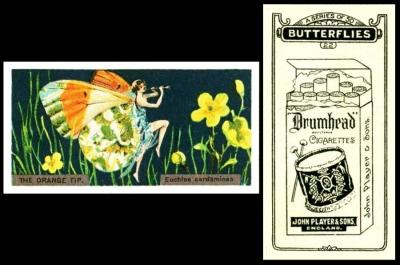
Here we have "orange", as represented by the Orange Tip Butterfly, transformed into a flighty young flapper girl. Now orange is the colour on the spectrum, and in the rainbow, that falls directly between red and yellow, the yellower tones serving to dilute the darkness of the red. And this is the way that painters make it too.
The odd thing is that the colour, first called orange in 1512, is actually named after the fruit - which was first named by the Tamils as naram. The Tamils gave this word to Sanskrit, which altered it slightly and made it naranja - though they thought it referred to the tree and not the fruit - and this spread throughout Asia and Europe to France, who gave it to us in the Middle Ages as pomme d`orenge or pomme narenje, almost certainly orally because though naranje and orenge look dissimilar, they pretty close in spoken word.
As far as our card, this first appears in our original John Player reference book (RB.17, issued in 1950), but with a different title to the one usually given it, namely :
38. 50. BUTTERFLY GIRLS. Butterflies with girls` bodies. Small cards. Fronts in colours. Backs in black. Overseas issue, about 1926.
A. Player`s "Drumhead" packet on back, no descriptive text.
B. Backs with descriptive text, anonymous issue.Similar series issued with "Cigarillos Club" (Spanish language backs); medium size issues were also made by B.A.T. with "Albert" Cigarettes and with anonymous backs.
As this is a Card of the Day, it therefore becomes the home page for this set and its variations. These are described within the British American Tobacco reference book, RB.21, issued in 1952, as :
217-38. BUTTERFLIES (Girls). Note revised series title. This series was issued as follows :
I - Small cards.
A. Player Overseas issue. Titled "Butterflies"
B. Anonymous issue, with letterpress on back. Titled "Butterflies"
C. Club issue. Titled "Mariposa". Back on cream yellow board, inscribed in red in Spanish : "Mariposas (Serie de 50). No. ... Cigarillos "Club", Con boquillas de oro y corcho."II - Medium cards.
D. Anonymous issue, with letterpress on back. Titled "Butterflies"
E. Albert Issue. No series title. Back inscribed in red "Cigarettes Albert"Printings A-D are numbered; E is unnumbered. A list of captions from fronts in the order of the numbered printings is given below; Latin names only are quoted, although some cards bear captions in English in addition, and card No.14 has caption in English only.
There is a list which follows, but this was way too complex to retype, so it is attached as a scan...
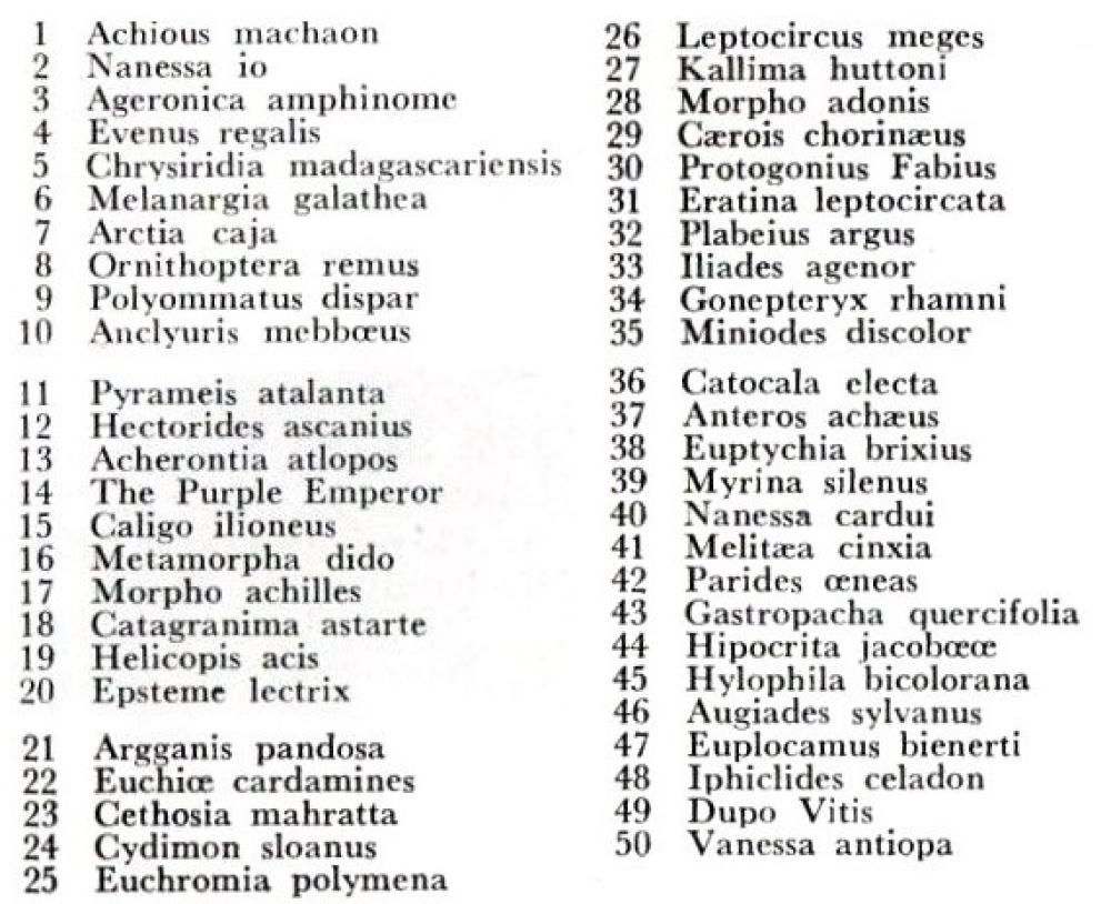
As far as where these cards were issued, A was in Malaya and Siam. B in Malta, C in South America, and by British American Tobacco, D we do not know yet, and E was in Belgium and the Belgian Congo. All this information is extracted from the front of the British American Tobacco reference book.
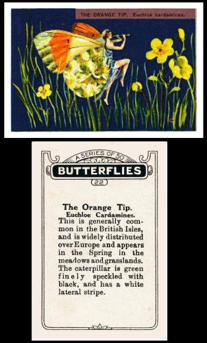
This seems an opportune moment to show you our card the medium anonymous format, to compare how it differs.
The first thing you will notice is that the image on our card is not just reduced in size, as you might imagine. Instead only the middle portion of the medium sized card is used, the top and the bottom portions being removed. This means that the title on the medium card has had to be relocated, and split, to either side of her dancing feet.
We will start to do a bit more of this as we progress through the indexing.
Also we include the reverse in this picture, simply because it tells of the butterfly depicted, which is something sadly missing from our version.
Now in our World Tobacco Issues Indexes our set is described under the Export issues of the Player listings, where we find out that it was issued, "Chiefly in New Zealand, Malaya and Siam". It is catalogued. in both the original volume and the updated one, as :
BUTTERFLIES. Sm. Girls with butterflies` wings. Nd. (50). See RB.21/217-38.A
Wednesday, 23rd October 2024
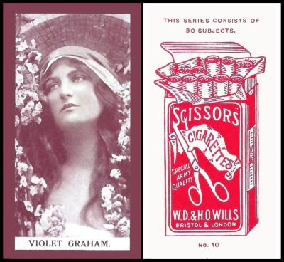
Today we tackle purple. As we mentioned in our look at pink, purple is made by adding blue to red. That makes it a curious mixture of the outwards excitement of red and the quiet internal reflection of blue - is it any wonder that purple shades are so attractive to those of mystical beliefs and powers?
The thing I found most curious about purple is that though many people confuse it with the very similar colour known as violet, in French there is no such word as purple, only violet. It therefore is most fitting that we have this lady, Violet Graham. However, I have to admit that tracking her down has not been easy, and I kept running into contradictions. Eventually I realised that there were two actresses listed as Violet Graham -
The first was born on the 9th of November, 1883, in Piccadilly, London, who appeared in three films (On the Banks of Allan Water, 1916 - Derelicts, 1917 - and Auld Lang Syne, also 1917, the last two of which were directed by Sydney Morgan. She was married to Talbot Stephenson Homewood, who was a Lieutenant in the Royal Garrison Artillery during the First World War, and he survived. It is presumed that she left acting either when he returned from the war, or she married him after the war and became a wife instead of an actress. She died on February 23, 1968 in Kensington, London.
The second was born in 1890, and, curiously, also on the 9th of November. She is recorded as having appeared in ten films, starting with a stage play, "The Arcadians", in 1909,. Her first film was "Jobson`s Luck" in 1913 and her last "Lily of Laguna" in 1938. However, looking down the list, we find another coincidence, for it includes the same three films as our other actress was in. And, even more confusingly, though there is more information about this second actress, there is no firm date of death, only a rather sketchy "1967-68".
I feel, therefore, that these two must be one, recorded by different people on different sites without ever realising.
The colour, in art, is made by mixing red and blue. However originally it was made from a mix of haematite and manganese - this being in prehistoric times, and it is the materials with which many of the early cave paintings were made, approximately twenty thousand years before the birth of Christ. Later on, around the Mediterranean, and some other countries with access to the sea, it was made from sea snails, specifically one which was recognisable enough to be called the spiny-dye murex, This was caught by the millions, and each snail was de-shelled and soaked, then a really tiny gland was removed, squeezed, and the contents left in the baking sun, but continuously watched, as it changed colour, until the right shade of purple was arrived at for the clothes that were waiting to be dyed. No wonder then that it was the colour associated with Royalty and the Church.
Surprisingly this set, and what is considered to be the first series to it, were not recorded in our Wills reference books right until RB.16, which was published in 1950. The reason for this may well be that it was printed locally, in India, and we know that because it does not appear in the listing of dates which was extracted from the Wills` Works Magazine. Therefore, we can safely say that it was probably both a fairly short issue, and one which crossed the seas to home in very small quantities.
Until I use what is thought to be the first series, I will insert both of them, as extracted from RB.16, in here. The listing for the earlier set reads :
120. 30. ACTRESSES - Unicoloured I (adopted title). Size 63 x 37 m/m. Fronts per Fig. 70, printed by letterpress, unicoloured. Export issues, between 1908 -13. Similar series issued by Ogden.
"SCISSORS" ISSUES - Fronts in purple brown. Backs with illustration of "Scissors" packet :-
A. Backs in red. Numbered. Inscribed at head, "This series consists of 30 subjects"
B. Backs in purple brown. Unnumbered. Inscribed at both sides "These cigarettes are made in England".
"GENERAL OVERSEAS ISSUES - Plain backs, unnumbered, anonymous issues :-
C. Fronts in purple brown
D. Fronts in light brown
Then there is a listing of the cards, which presumably relates to series C and D, being that they were unnumbered.
Our set is listed as :
121. 30 ACTRESSES - Unicoloured II (adopted title). Size 67 x 37 m/m. Fronts per Fig. 71, printed by letterpress, unicoloured in purple brown. Backs in red, with illustration of open "Scissors" packet, inscribed at head "This series consists of 30 subjects" numbered at base. This series is sometimes referred to as a second series to item 120 above. "Scissors" issue between 1908-13
Now in our World Tobacco Issues Index we are additionally told that "Scissors" was "issued in India, and in areas where British Garrisons were stationed". In these books the sets are split up, with the "Scissors" branded ones listed together as :
ACTRESSES - W/120 (A). Sm. 63 x 37. Purple-brown. (30) See W/120.
A. Back in red. Numbered
B. Back in purple brown. Unnumbered.ACTRESSES - W/121 (A). Sm. 67 x 37. Purple-brown. (30) See W/121. ... :
and the others having been shunted off to the back of the book, where they appear as either ZJ3-9 in the original World Tobacco Issues Index, or ZJ03-050 in the updated volume. The text, in both, reads :
ACTRESSES - W/120 (A). Sm. Unnd. (30). Issued through B.A.T. in Malta and India. ...
a. Fronts in purple brown. Size 62 x 37. See W/120.C
D. Fronts in light brown. Size 63 x 37. See X21/200-120.D
That "X" code is in the Handbook to the World Tobacco Issues Index, but it depend on which version you have - for at first it was a separate volume, then it was reprinted at the back of the book. Either way that is quite interesting, for it reads :
X21/200-120. ACTRESSES - W/120. Note revised series title. Printing D - Anonymous plain backed issue with light brown fronts consists of the same 30 subjects as the other printings but the style of front is not exactly as illustrated at Fig.70 on page 125 of Wills IV. In printing D the subjects have a white line with occasional design in the centre of the border.
Thursday, 24th October 2024
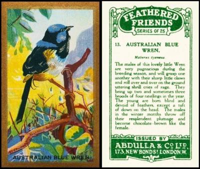
Here we have blue, courtesy of the Australian Blue Wren. Blue is another color with ancient origins, right back to ancient Egypt, when a piece of mineral, called azurite, was shattered and revealed of a brilliant blue tone. Azurite, as you might have guessed, is the source of the word azure. However it was centuries later that artists discovered that if you crushed the mineral and ground it down to a powder you could use it for painting. And they called that ultramarine. It remains one of the most popular colours and yet the most elusive, and the hardest of all to make in combination, too strong to combine well with most.
The name "blue wren", might have been the universal term for this lovely creature then, but it seems to have gone out of fashion, and we now call them by the name of Superb Fairywren - though a clue to the original name still remains in its Latin form, which is Malurus Cyaneus. The Malurus bit is the family name, and there are almost thirty different species who are under that umbrella, all songbirds, though a few of them, curiously, seem to be regarded as part of the warblers.
The odd thing about our bird is that for most of the year you would not recognise him - this is the breeding plumage, or, more correctly, the showing off stage, the brighter the blue, or so they believe, the more lady wrens they will be able to snuggle up with.
Now this is a set of many parts, for it was issued by Cavanders as "Feathered Friends" and as Foreign Birds", and also by Godfrey Phillips as "Feathered Friends". All this is explained on the home page for this group, which is our Card of the Day for the 3rd of September 2024 - that card being Cavanders` "Foreign Birds".
Our version appears in our Abdulla reference book, RB.5, which is shared with Adkin and with Anstie. It is described as :
1935. FEATHERED FRIENDS (titled series). Size 2 1/2" x 1 1/2". Numbered 1-25. Fronts lithographed in full colours, and gold and silver. Gold borders and subjects titled. Backs, printed in green, with descriptions. Similar to Cavander`s and Godfrey Phillips` sets. Printed by Wass, Pritchard & Co. Ltd., London.
The sets are identical from the front, so it is fairly certain that Wass. Pritchard & Co. Ltd. printed them all - however, intriguingly, their name only appears in this reference book, not the Godfrey Phillips one. And Cavanders never had a reference book, their cards only appear in our World Tobacco Issues Index. There is something odd though, and that is that the Godfrey Phillips reference book tells us that their cards were produced by letterpress, not lithography. Now letterpress involves a raised design being inked and pressed to the card, rather then the more laborious, and some may say old fashioned, process of lithography, where the design is drawn flat and made to stay in place by a combination of chemicals.
Sadly I cannot find much about Wass, Pritchard & Co. Ltd., but I did discover that they also printed books, and, intriguingly,that they made lantern slides for early film displays.
This text is much shortened in our original World Tobacco Issues Index - to simply :
FEATHERED FRIENDS. Sm. 63 x 38. Nd. (25) See Ha. 516 ... A5-14
whilst in our updated version it says :
FEATHERED FRIENDS. Sm. 63 x 38. Nd. (25) See RB.113/70 ... A065-440
RB.113, by the way, is the newly updated Godfrey Phillips book. This is because Abdulla & Co. had been associated with Godfrey Phillips Ltd. since 1926, when the latter bought up the ordinary share capital of the former.
Friday, 25th October 2024
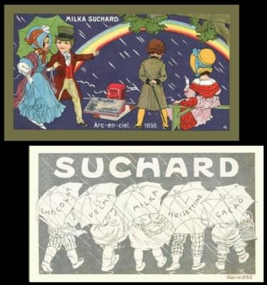
Finally then we have the rainbow in all its glory, displaying of all the colours we have discussed over the week. Little wonder that it is a popular symbol for unity and acceptance, and represents a long sought after place where we can feel free to express our whole selves, without being disrespected for our feelings.
This set also fulfils this week`s brief of being highly coloured. It shows children, in period costume, and they are amazingly cute cards. However not all of the cards have a four number date as we know it, most have either "siecle" which means century, or a period like "Empire". Nobody seems to agree on what the set was planned to be called, either, and so there are many different titles, though the English translation that seems the most prevalent is "Weather Phenomena" - I tend to feel this is not right, for though there are phenomena in as much as rare events, like the earthquake, the cards of rain, and cold, are what we call normal weather.
Perhaps, though the back is a most charming image, it would have been an idea to have just a little information there as well. Don`t you think?
The cards I know of so far are :
- La Chaleur - Moderne - heat
- Le Vent - Empire - wind
- Arc-en-Ciel - 1830 - rainbow
- La Pluie - 1850 - rain
- Tempete - moderne - storm at sea
- L`Inondation - XIII siecle - flood
- La Grele - Louis XIII - hail (number on left hand side of front)
- Le Froid - XVI siecle - cold
- L`avalanche - IX siecle - avalanche
- La Neige - Louis XV - snow
- Le Tremblement de Terre - Louis XVI - earthquake
Thanks to everyone who supplied one or more of these, and we are still after a description for card number three. When I started this list, do note it was in two parts - the second being a list of cards that looked the same but had no numbers, then I was informed that these did have numbers, and on the fronts, but not in the same place as the ones I had already found and put in the first list.
And there we ride off into the sunset for another week, or, more correctly, roll over and fall asleep until the morning, not that it is very light when I wake up these days, and certainly not light enough to read. Tonight it is also raining, which leads me to the observation that whilst I am not fond of rain in the daytime, I love listening to it at night.
I am afraid I did little of the index checking this week, and have not yet done much of the A. & B.C. Gum football card checklist either. Hopefully I will have time for both those things over the weekend - and will report back with any progress.
By the way, don`t forget to check our latest auction catalogue - for this time next week it will have ended, and there are some great items within it. And may we remind you that we are happy to accept bids on our lots from non members, but we do charge them a buyers premium, which members of the Cartophilic Society do not have to pay.
Thanks for tuning in, and also thanks to everyone who supplied cards, information, or ideas to keep the newsletters so interesting. See you all next Saturday.....
